Posted on 09/08/2011 12:30:50 PM PDT by CodeToad
BTTT. Great work, thanks.
Thought this might be of interest to you.
Thanks. It took a number of hours but it was worth it.
I’m still trying to figure out what everything is.
Legends help, fyi.
Green = Debt went down, also shown by values in ().
Red = Debt went up.
Absolutely STUNNING!
Thank you very much!
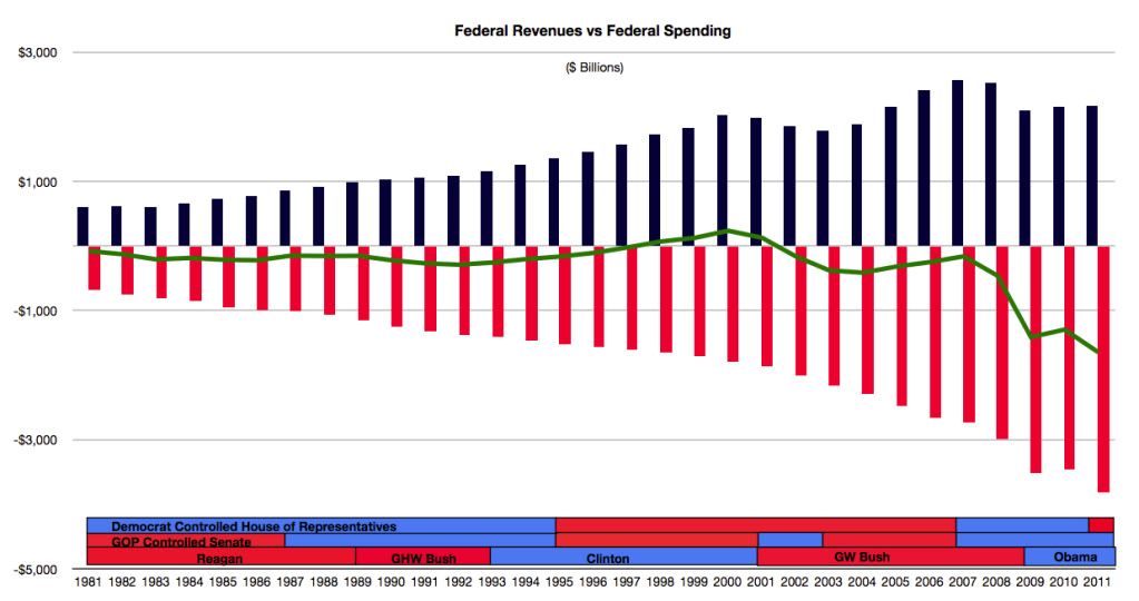
Very cool. What is interesting is that our least spending has been with a Democrat President and a Republican controlled Senate and House.
Know of any good ping lists that might be interested?
The problem, however, is that a sea of numbers glazes over the eyes.
A visual solution is a chart in the style of Minard's famous map of Napoleon's march to Moscow. The width of the line denotes the number of troops still alive in Napoleon's Grand Army. The shocking information is conveyed at a glance. (Below)
In the case of a debt chart, for historical accuracy, debt numbers should be in inflation-adjusted, per capita debt dollars.

Ah cain’t figyer it owt. Is there an abridged version for dummies?
That’s an awesome “tableau graphique,” especially for the era!
Per capita and inflation adjusted numbers don’t tell the whole and accurate story. The percentages, however, do. People really don’t care what the actual numbers are, just how much the changes have been. Besides, no one has accurate inflationary figures to adjust dollar figures by. So, if $1 was spent in 1791 what, excatly, would that number be for 2011? No one really knows.
I find it best to leave all numbers as they were originally reported and let the reader determine what the numbers mean to them. One thing our government does is play loose with number using “seasonally adjusted” or “adjusted for inflation” or “per capita” numbers. They are meaningless as they have no concrete basis, so people do not trust them. Real numbers as reported tend to have more meaning.
The left side of the chart shows individual years and the national debt plus the percentage change from the year before.
The President, Senate, and House columns show the debt during the continuous period held by that political party.
The Period column shows the debt for the period of the specific combination of President, Senate, and House party. A Period is a period of time during which the controlling party of the President, Senate and House does not change.
The Event column is simply to show major events during that period of time that might sugggest why spending was higher than normal.
Unfortunately, I do not know the narratives as to why spending increased or decreased. There is little to go on other than news reports that are themselves biased and inaccurate.
I am letting the numbers speak for themselves. We cannot go back in time and try to conclude why a budget was more or less; we can only say that it was. Attempting to rationalize spending is extremely difficult and horribly inaccurate. What political pressures were exerted is unknown, as everything from personal political views to political lobbyists play heavy in all political actions, and those activities are simply unknown.
ping
I respectfully disagree because just going for the shock value of "Look how much the debt has grown since the 1700's" will bring the counter-argument one second later of, "Of course it has grown by a huge percent. The population has grown by a huge percent.".
It costs far less money to run a country of 4 million (the U.S. in 1790) than it costs to run a country of 308 million (the U.S. in 2010).
When a population has tremendous growth over time, even if the per capita debt is kept constant with impeccable financial conservatism, the total debt chart would be a mirror image of the population growth chart:

A “Per Capita” comparison attempts to rationalize debt. There are baseline numbers such as defense. How much defense today in 2011 does it take to defend this nation from known enemies? That number would be the same regardless if we had 100 million or 200 million citizens.
The purpose of the chart is to show the increase each political party has caused during their period of control. Comparing actual dollars from one year to the next is fine enough as few periods exceeded but a few years. The chart also shows percentage increases which helps define the differences.
A full analysis would be needed to determine fault, to include categories of expenditures, political pressures, agreements made, etc, when all people want to know is when a Republican or a Democrat holds the presidency, Senate or House what happens to spending. Does it go up a lot, a little, or down any? What about the relationship between the President and Congress? What about the Senate versus the House? This chart gives meaning to those questions by providing the data for the answers.
Disclaimer: Opinions posted on Free Republic are those of the individual posters and do not necessarily represent the opinion of Free Republic or its management. All materials posted herein are protected by copyright law and the exemption for fair use of copyrighted works.