Skip to comments.
MOST CHARITABLE STATES--RED OR BLUE?
Michelle Malkin Archives ^
| 11/10/04
| Michelle Malkin
Posted on 11/10/2004 7:09:06 PM PST by Cicero
MOST CHARITABLE STATES--RED OR BLUE?
By Michelle Malkin · November 10, 2004 08:46 AM
Several readers have sent me this ranking of states by IQ, purporting to show that people in red states are dumber, on average, than people in blue states. Like a lot of what the Democrats have spewed this election cycle, the IQ chart--pushed most prominently by Bush-hater Howard Stern--is a hoax.
The Generosity Index, compiled by The Catalogue For Philanthropy, is for real. It is computed by taking each state's average income and average charitable contribution, then subtracting the second rank from the first to get a single number for each state.
I've adapted the table to show the 2004 presidential election results, by state, ranked by generosity. (Click here for the table in MS Word format; if anyone can convert the table into a jpeg, please let me know.) Many thanks to reader Richard Davis, who alerted me to The Generosity Index and came up with the title of this post.
Update: Thanks to David Schmitt and other readers, I'm now able to post the Generosity table as a jpeg:

TOPICS: Culture/Society; Politics/Elections
KEYWORDS: ammo; bushcountry; giving; philanthropy
Another home run by Michelle.
1
posted on
11/10/2004 7:09:06 PM PST
by
Cicero
To: Cicero
Sorry, the picture (chart) doesn't link. You'll have to visit the web site as given above.
2
posted on
11/10/2004 7:10:21 PM PST
by
Cicero
(Marcus Tullius)
To: Cicero
Howard Stern! Now there's the ultimate authority on intelligence.
This is in todays Chicago Tribune as well... :)
4
posted on
11/10/2004 7:16:18 PM PST
by
oolatec
To: Paul Atreides
What Michelle's chart shows is that the first 25 states in order of generosity are ALL pro-Bush. That's fully one half of all the states before the first state that voted for kerry kicks in. It's an amazing graphic. I'm only sorry it doesn't want to be linked.
It's massive proof of what I have always suspected after seeing the income tax returns of folks like Al Gore and looking at his charitable donations.
Democrats are stingy as hell with their own money. They only want to give away other people's money. Here's the proof.
5
posted on
11/10/2004 7:21:51 PM PST
by
Cicero
(Marcus Tullius)
To: Cicero
What did the hippies do in the 60s: gather together to roll around in the mud at Woodstock.
What happened in the 80s: people gathered for LiveAid to actually do something about the plight of Ethiopians.
To: Cicero
I also looked at comparison of Average Itemized Charitable Contribution relative to the Average Adjusted Gross Income for each state as direct percentages, not just as ordinal rankings, and it's pretty similar, but the problem is when you look at another item on the site: percentage of returns with Itemized Charitable Contributions.
It seems that the Kerry states (I HATE calling them "blue") are ranked high on that list. Bush states are at the bottom, with few of the returns having Charitable Contributions. That is, the Itemized Charitable Contributions on Bush-State returns are large, but there are few of them. Kerry states have more ICC, but they are--on average--smaller.
The site also breaks it down into categories by income. Still, there are some weaknesses in this point that she addresses.
7
posted on
11/10/2004 7:41:01 PM PST
by
Gondring
(They can have my Bill of Rights when they pry it from my cold, dead hands!)
To: Cicero
This ranking is biased against the states with the highest income.
For example, Connecticut, with an income rank of 1 cannot have a Generosity Index greater than 0 even if it was the most generous state in the country.
Try again, Ms. Malkin.
To: Gondring
That's because Dems are such tightwads when they're spending their own money for a change that they will itemize donations totalling 3 pairs of used underwear at $2.00 a pair and the 1.3 gallons of gas they used delivering them.
9
posted on
11/10/2004 8:12:32 PM PST
by
CGTRWK
To: Cicero
Generosity Index 2004: (2002 US State Data)
 |
Generosity Index > 1. Advanced Data:
2004_Generosity_Index.xls (an Excel document with multiple sheets -- split by AGI brackets -- with detailed data from 2002 and rankings)
2. Basic Data:
Click column headings below to sort by a new column.
(See also: Technical Notes)
| State |
Having
Rank |
Giving
Rank |
Rank
Relation |
Generosity
Index |
| Mississippi |
50 |
5 |
45 |
1 |
| Arkansas |
47 |
6 |
41 |
2 |
| Oklahoma |
43 |
8 |
35 |
3 |
| Louisiana |
42 |
10 |
32 |
4 |
| Alabama |
38 |
7 |
31 |
5 |
| Tennessee |
34 |
3 |
31 |
6 |
| South Dakota |
44 |
14 |
30 |
7 |
| Utah |
31 |
2 |
29 |
8 |
| South Carolina |
40 |
12 |
28 |
9 |
| Idaho |
41 |
20 |
21 |
10 |
| Wyoming |
21 |
1 |
20 |
11 |
| Texas |
23 |
4 |
19 |
12 |
| West Virginia |
48 |
31 |
17 |
13 |
| Nebraska |
35 |
19 |
16 |
14 |
| North Dakota |
46 |
30 |
16 |
15 |
| North Carolina |
27 |
15 |
12 |
16 |
| Kansas |
25 |
18 |
7 |
17 |
| Florida |
20 |
13 |
7 |
18 |
| Georgia |
17 |
11 |
6 |
19 |
| Kentucky |
39 |
33 |
6 |
20 |
| Montana |
49 |
43 |
6 |
21 |
| Missouri |
29 |
24 |
5 |
22 |
| New Mexico |
45 |
40 |
5 |
23 |
| Alaska |
24 |
21 |
3 |
24 |
| Indiana |
28 |
29 |
-1 |
25 |
| New York |
5 |
9 |
-4 |
26 |
| Iowa |
36 |
44 |
-8 |
27 |
| Ohio |
32 |
42 |
-10 |
28 |
| California |
6 |
17 |
-11 |
29 |
| Maryland |
4 |
16 |
-12 |
30 |
| Illinois |
10 |
22 |
-12 |
31 |
| Maine |
37 |
50 |
-13 |
32 |
| Delaware |
13 |
27 |
-14 |
33 |
| Washington |
11 |
25 |
-14 |
34 |
| Vermont |
33 |
47 |
-14 |
35 |
| Oregon |
26 |
41 |
-15 |
36 |
| Hawaii |
30 |
45 |
-15 |
37 |
| Virginia |
7 |
23 |
-16 |
38 |
| Arizona |
22 |
38 |
-16 |
39 |
| Nevada |
14 |
32 |
-18 |
40 |
| Pennsylvania |
18 |
36 |
-18 |
41 |
| Michigan |
16 |
35 |
-19 |
42 |
| Colorado |
8 |
28 |
-20 |
43 |
| Connecticut |
1 |
26 |
-25 |
44 |
| Minnesota |
12 |
37 |
-25 |
45 |
| Wisconsin |
19 |
46 |
-27 |
46 |
| New Jersey |
2 |
34 |
-32 |
47 |
| Rhode Island |
15 |
49 |
-34 |
48 |
| Massachusetts |
3 |
39 |
-36 |
49 |
| New Hampshire |
9 |
48 |
-39 |
50 |
|
|
10
posted on
11/10/2004 8:29:02 PM PST
by
DaveTesla
(You can fool some of the people some of the time......)
To: Cicero
Michele and Ann, conservatives are so fortunate to be represented by their class and talent.
Comment #12 Removed by Moderator
To: cRazYDaVe
Tell me: What is the highest "Rank Relation" Connecticut can earn. Let's assume it retains its status as the wealthiest state and during 2004 made 99.99999% of all charitable contributions in the United States (the most contributions by a factor of many)?
The best Connecticut could do is for all states to tie using this index.
To: cRazYDaVe
No, that's not the methodology.
The ordinal ranks are created FIRST, and then the ORDINAL ranks are subtracted. The raw AGI per capita versus Charitable Deductions per capita comparison is NOT made.
See my post #7 above... I point out that the general pattern is similar when you use actual amounts, not just ordinal ranks, but that's also a very selective analysis of the data. Let's not play the same games the lefties do.
14
posted on
11/11/2004 12:45:34 PM PST
by
Gondring
(They can have my Bill of Rights when they pry it from my cold, dead hands!)
Comment #15 Removed by Moderator
Comment #16 Removed by Moderator
To: cRazYDaVe
Uh...re-read the posts. I GAVE a better method. I gave a few better methods.
Why not do raw comparisons and then do ordinal ranking? Why not consider the percentage of returns that contain charitable contributions?
I'm a country boy and know the sound of crickets chirping... nice for quiet contemplation. Listen to them and think a bit.
17
posted on
11/11/2004 11:30:22 PM PST
by
Gondring
(They can have my Bill of Rights when they pry it from my cold, dead hands!)
To: Gondring
I hope this doesn't mess up formatting or something, but here's a GIF of all the data in Excel, sorted by the "Generosity Percentage Index" (Ranking of "ICD divided by AGI")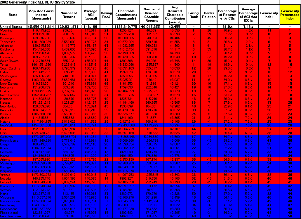
and
by "Percentage of Returns Reporting ICDs"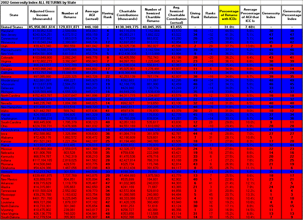
Note that the patterns are not direct inverses. I'm not a statistician, but I'm sure someone could extract the relevant information that makes the two differ from being inverses, and decide whether that is relevant. Part of it depends on what we wish to define as "more generous," though.
18
posted on
11/11/2004 11:50:05 PM PST
by
Gondring
(They can have my Bill of Rights when they pry it from my cold, dead hands!)
Disclaimer:
Opinions posted on Free Republic are those of the individual
posters and do not necessarily represent the opinion of Free Republic or its
management. All materials posted herein are protected by copyright law and the
exemption for fair use of copyrighted works.
FreeRepublic.com is powered by software copyright 2000-2008 John Robinson
