Depends if one believes the government statistics on inflation used to calculate real income.
I do not.
Put that BS up against inflation now. Defeated my ass.
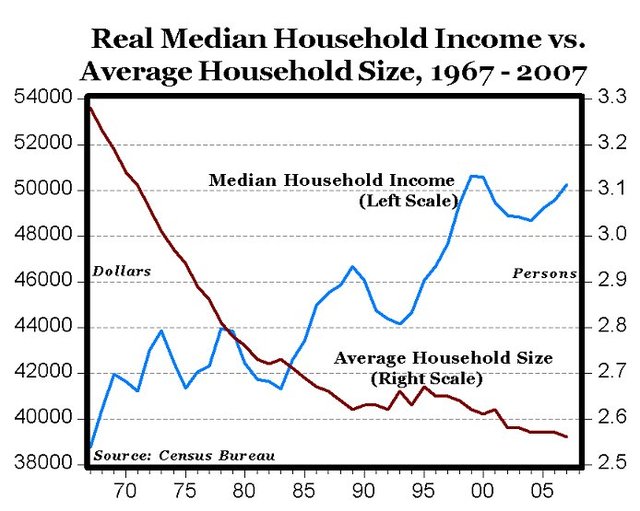
Nice graph, but remember, the financial crisis and the subprime meltdown started in 2008. Do you have the graph showing what happened after 2007?
A graph showing the average income for all US households proves nothing. Do you have one that shows average household income for four of five income categories, from the lowest to the highest?
Your graph doesn’t even relate to the topic of the article: the middle class, not an overall average income.
Here's a dollar value chart for 1973-2009. Looks like about a 28% drop across the same timeframe. That easily wipes out the 19% gain in *real purchasing power per household*. (Click for link of source.)

P.S. I'd hate to see what the this chart would look like if extended to the current date.