Posted on 11/21/2009 6:41:34 PM PST by dila813
File called trend_profiles_dogs_dinner.png in the hacked files shows a chart that looks identical in format but with a completely different result than the one on display that is showing heating in the Tropical tropospheric trend.
The one in the hacked files shows Global Cooling Trends and not a warming trend.
In fact, the chart in the hacked files can't be found and based on the date of the file you have to wonder if the one at Real Climate is a complete fabrication or the one in the hacked files is.
The date on the file is 1/10/2008 and the one published is 10/12/2008.
Great, it is good enough so everyone can see that it is showing global cooling is kicking off.
I think this is the smoking gun.
I deleted it, I wasn’t sure if I was allowed to host it there or not.
I really think this is what this hacker wanted us to see. If you look at it and the link above. These are the same thing, but one must be true and the other is false.
This chart says we are undergoing massive global cooling and that the finger print of Human Induced Warming is completely missing.
This is another nuke going off in the GWA community once everyone figures out what this is.
“it says the climate is cooling fast. “
Darn right it is. Here in my Midwest location, temperatures have cooled dramatically in the past 3 months.
The oak and maple trees all have lost their leaves and look dead.
The corn and soybean have quit growing; and snow is a possibility next week.
Our daily high temperatures have dropped from the 80’s to the 50’s.
Something is going on. I hope they can find out what is, and come up with a action plan.
You had yours at photobucket, same place mine is at.
What do you think? is this the bomb the hacker wanted us to see?
I think another bomb is that these guys accused a Chinese researcher of misconduct and he was found innocent.
My vote if for one of these two things to being the chief reason for the files being released.
Check the thread again, we have the charts now, you can see what we are talking about.
OK, Palmer. Explain to me what I’m looking at, here. I have it downloaded in my files and ran across it....but hadn’t a clue what this meant. I was more interested in reading the emails. :)
I am still looking at the data files to see if there is more evidence for cherry picking in Briffa Yamal.
compare the two pics, one shows the warming trend in the upper atmosphere and the other shows a cooling trend.
I think we should do exactly the opposite of what my Dad was constantly yelling when I was a kid:
“Close the door! I’m not paying to heat/cool the outdoors!”
Let’s just turn on our AC/Heaters, open the doors and see if we really do impact the climate.
Look at the charts though, one clearly shows a warming trend, the other shows temps crashing.
What’s up with that?
Meaning from Google: Dressed or displayed in an ostentatiously smart manner.
Also, in Europe they usually order their dates: Day/Month/Year
So those two files were probably created two months apart, with the whistle blower's file being first.
No, look at it again, these are different heights in the atmosphere.
To the Right is warming, to the left is cooling. There is more info on how to read this at the link above.
Thanks for posting this .
I was trying to figure this thing out yesterday.
Yes, but one has the curves shifted to a temp increase, the other one (hacked) shows only warming on the surface but cooling at all other elevations.
If this is true and I was them, I would want to hide this too.
It completely blows human induced global warming off the map.
Look at the link on RealClimate, these are the same charts with different results.
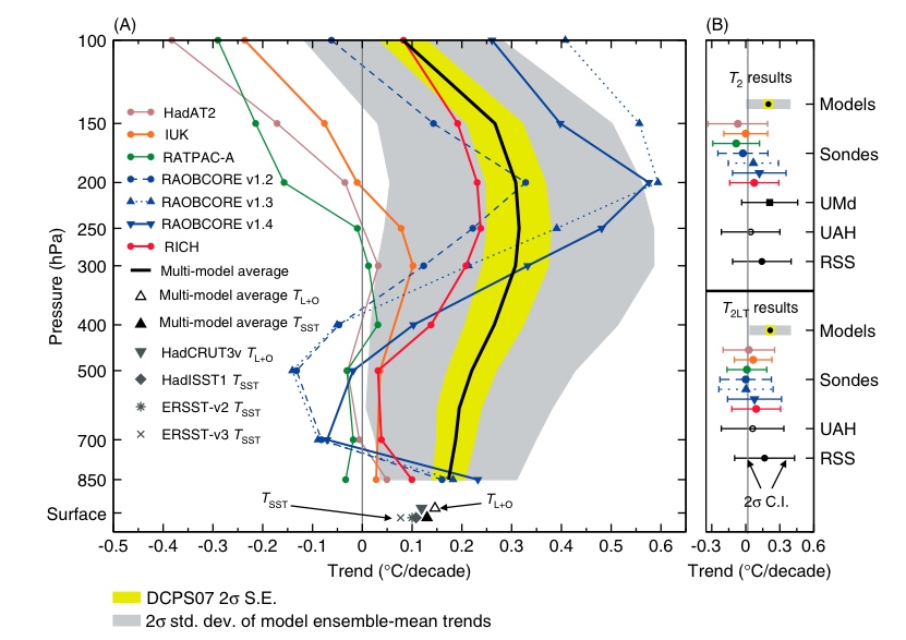
One of those papers was one I looked at closely and it basically used a climate model (!) to interpret the satellite readings to say that the upper troposphere has warmed. Anyway the warmists basically want there to be upper tropo warming and stratospheric cooling so that they can say their models are just awesome. The chart from "real" climate is one that shows just that, the atmosphere warms going up into the troposphere, then cools higher up (the vertical axis is basically height above ground using the scale of atmospheric pressure which gets lower as you go higher).
Then there is reality which is admittedly difficult to measure. The really accurate satellites have not been around long enough to see the trends. OTOH, the weather balloons have been around long enough and show steady or cooling temps. The chart that came from the zip file basically shows that. That zip file came from the warmists server, so they obviously had this chart but uncherrypicked it (cherryskipped?). The balloons have some controversy, mainly that they are almost always released over land (leaves a large part of the earth unmeasured) and they have accuracy issues as they relay their measurements back to earth.
Disclaimer: Opinions posted on Free Republic are those of the individual posters and do not necessarily represent the opinion of Free Republic or its management. All materials posted herein are protected by copyright law and the exemption for fair use of copyrighted works.