Free Republic
Browse · Search
News/Activism
Topics · Post Article

Skip to comments.

Decade Long Federal Test To Replace Highway Sign Font Made Legibility Worse
Jalopnik.com transportation.gov ^ | 02/04/2016 | Justin Westbrook

Posted on 02/05/2016 6:52:45 AM PST by prisoner6

The U.S. Federal Highway Administration is killing the current decade-long test of looking into replacing highway signs with a new “Clearview” font it designed and developed to be more legible because, twelve years later, it turns out the new font actually made sign legibility worse.

Back in 2004, the Federal Highway Administration approved state use of a new font ironically called “Clearview” to be the new face of highway signs around the nation. At the time, testing had “proven” that the new font was more legible to drivers, specifically at night, than the old signs featuring the “Highway Gothic” typeface.

It turns after twelve years of integrating the new font onto select highway road signs around the country, “Clearview” has been proven to not be any more legible than the old highway sign font. Not only that, but the new font is actually worse for legibility on signs with negative-contrast color schemes. That signs with dark letters on light backgrounds—you know, like SPEED LIMITS.

(Excerpt) Read more at jalopnik.com ...


TOPICS: Business/Economy; Government; News/Current Events
KEYWORDS: cars; clearview; driving; travel
Navigation: use the links below to view more comments.
first previous 1-2021-4041-56 next last
To: PJBankard

I’m just surprised it isn’t Bi-lingual.

Or, maybe have a notice underneath...

Flash lights for Spanglish.


21 posted on 02/05/2016 7:14:20 AM PST by tet68 ( " We would not die in that man's company, that fears his fellowship to die with us...." Henry V.)
[ Post Reply | Private Reply | To 15 | View Replies]

To: The_Media_never_lie

Ask Juan D. Rection.

(otherwise, the keystone background may be clue.)


22 posted on 02/05/2016 7:14:22 AM PST by Calvin Locke
[ Post Reply | Private Reply | To 5 | View Replies]

To: prisoner6

Back in the day the NYS Thruway had their entrance and exit signs lettered with little reflective disks.


23 posted on 02/05/2016 7:14:26 AM PST by quietly desperate
[ Post Reply | Private Reply | To 1 | View Replies]

To: buckalfa

Do you prefer the font, or the new signage with whiter newer letters? The new clearview font has the letters spaced closer together, which might not be as easy to read when you are actually driving over 40 mph. I think when the clearview signs age, they may be more difficult to read at driving speeds, and not just while you’re at a standstill.


24 posted on 02/05/2016 7:15:52 AM PST by FamiliarFace
[ Post Reply | Private Reply | To 8 | View Replies]

To: prisoner6

I can’t remember ever having a problem reading highway signs, before or after. But for the past 10 years or so I’ve relied on the “B*tch in the Box” for navigation anyway...


25 posted on 02/05/2016 7:16:08 AM PST by bigbob ("Victorious warriors win first and then go to war" Sun Tzu.)
[ Post Reply | Private Reply | To 1 | View Replies]

To: tet68
Drive South Flash lights for Spanglish.

Fixed it.
26 posted on 02/05/2016 7:17:22 AM PST by PJBankard (It is the spirit of the men who leads that gains the victory. - Gen. George Patton)
[ Post Reply | Private Reply | To 21 | View Replies]

To: null and void

Basically, government is everyone’s ex-wife.


27 posted on 02/05/2016 7:19:59 AM PST by Boogieman
[ Post Reply | Private Reply | To 11 | View Replies]

To: prisoner6

Helvetica Forever! (LOL!)


28 posted on 02/05/2016 7:21:36 AM PST by left that other site (You shall know the Truth, and The Truth Shall Set You Free.)
[ Post Reply | Private Reply | To 1 | View Replies]

To: prisoner6

Try a cursive font. Maybe Obozo’s people will drive on by.


29 posted on 02/05/2016 7:23:19 AM PST by batterycommander (...Change your diaper, diaperhead. It's full of shiite.)
[ Post Reply | Private Reply | To 1 | View Replies]

To: prisoner6

The comparison is invalid because the letters are not the same color.


30 posted on 02/05/2016 7:24:47 AM PST by I want the USA back (The further a society drifts from the truth, the more it will hate those who speak it. Orwell.)
[ Post Reply | Private Reply | To 1 | View Replies]

To: Boogieman

*ouch*


31 posted on 02/05/2016 7:25:43 AM PST by null and void (This war starts in the spiritual realm-it will end in ours though.)
[ Post Reply | Private Reply | To 27 | View Replies]

To: buckalfa

I agreed until I had to get up. when I came back into the room, and looking at a distance, the old style was clearer and the letters did not blend together. Larger letters as Capitals seemed right too...


32 posted on 02/05/2016 7:25:51 AM PST by 3D-JOY (...don't forget to visit the FREEPATHON today!)
[ Post Reply | Private Reply | To 8 | View Replies]

To: batterycommander

33 posted on 02/05/2016 7:28:22 AM PST by fishtank (The denial of original sin is the root of liberalism.)
[ Post Reply | Private Reply | To 29 | View Replies]

To: prisoner6

That’s the Federal Government in a nutshell for you.


34 posted on 02/05/2016 7:32:04 AM PST by Durbin
[ Post Reply | Private Reply | To 1 | View Replies]

To: prisoner6

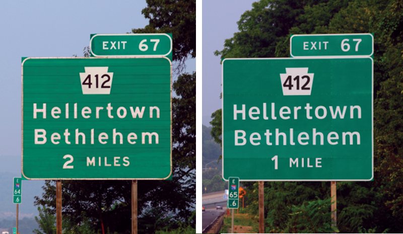
They look only somewhat better, but they made the drive a mile SHORTER!..................

35 posted on 02/05/2016 7:38:06 AM PST by Red Badger (READ MY LIPS: NO MORE BUSHES!...............)
[ Post Reply | Private Reply | To 1 | View Replies]

To: prisoner6

Communities near me are changing street signs from all caps to just the first letter capitalized because some thought the signs were YELLING at them. I kid you not...


36 posted on 02/05/2016 7:39:07 AM PST by Typelouder
[ Post Reply | Private Reply | To 1 | View Replies]

To: Red Badger

Well, they fixed the readin’ part but now they gotta git their cypherin’ down.


37 posted on 02/05/2016 7:43:19 AM PST by WorkingClassFilth (May God save the Republic. Go Ted!)
[ Post Reply | Private Reply | To 35 | View Replies]

To: 3D-JOY

The real test is how legible are they when you are driving past a sign at night at 70 MPH?

Of course, they could have easily tested the two fonts with a couple of signs at one or two locations rather than changing countless thousands of signs and making the entire U.S. into beta testers.


38 posted on 02/05/2016 7:58:04 AM PST by Bubba_Leroy (The Obamanation Continues)
[ Post Reply | Private Reply | To 32 | View Replies]

To: prisoner6

Not only less whitespace between the letters (tighter kerning), but the lower-case letters are closer to the height of the capitals and have more internal whitespace, and thus the “new” sign becomes more visually “noisy”.


39 posted on 02/05/2016 8:06:00 AM PST by Little Pig
[ Post Reply | Private Reply | To 1 | View Replies]

To: FamiliarFace
It may just be the new signage. With my level of eyesight, or lack thereof, contrast is important.
40 posted on 02/05/2016 8:06:47 AM PST by buckalfa (I am feeling much better now.)
[ Post Reply | Private Reply | To 24 | View Replies]


Navigation: use the links below to view more comments.
first previous 1-2021-4041-56 next last

Disclaimer: Opinions posted on Free Republic are those of the individual posters and do not necessarily represent the opinion of Free Republic or its management. All materials posted herein are protected by copyright law and the exemption for fair use of copyrighted works.

Free Republic
Browse · Search
News/Activism
Topics · Post Article

FreeRepublic, LLC, PO BOX 9771, FRESNO, CA 93794
FreeRepublic.com is powered by software copyright 2000-2008 John Robinson