To: pgyanke
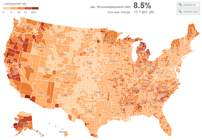
Here is a welfare concentration map by county. (kind of hard to read but the darker, the greater the concentration).
20 posted on
12/08/2011 2:13:01 PM PST by
mnehring
To: mnehring
That map is kind of interesting. It shows some of the most sparsely populated places as having higher concentrations of welfare recipients.
However, I know that some of the northern Michigan counties have 5000 residents total or less so it doesn’t take many to drive the percentage up. Its also important to note that there are few jobs there as well.
24 posted on
12/08/2011 2:22:36 PM PST by
cripplecreek
(Stand with courage or shut up and do as you're told.)
To: mnehring
Your legend says it a map of unemployment, not welfare. Thank you, though.
26 posted on
12/08/2011 7:19:12 PM PST by
pgyanke
(Republicans get in trouble when not living up to their principles. Democrats... when they do.)
FreeRepublic.com is powered by software copyright 2000-2008 John Robinson