To: BenLurkin
Here's a live magnetic image of the Sun (a magnetogram) from Nasa's SOHO website. The black and white regions depict areas of opposing magnetic polarity. Notice in the upper hemisphere white regions are to the left of black ones, and in the lower, to the right. I'm referring to B/W areas in relative close proximity.
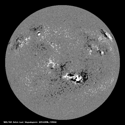
Now see how it all makes sense in terms of the model or explanation below...

http://sohowww.nascom.nasa.gov/data/realtime/hmi_mag/512/
8 posted on
01/08/2014 8:05:34 PM PST by
ETL
(ALL (most?) of the Obama-commie connections at my FR Home page: http://www.freerepublic.com/~etl/)
To: ETL
That SOHO link at the bottom is only to the magnetogram (large gray image of the sun). The other graphic I found elsewhere.
9 posted on
01/08/2014 8:08:00 PM PST by
ETL
(ALL (most?) of the Obama-commie connections at my FR Home page: http://www.freerepublic.com/~etl/)
To: ETL
10 posted on
01/08/2014 9:11:28 PM PST by
BenLurkin
(This is not a statement of fact. It is either opinion or satire; or both.)
To: ETL
A solar hurricane in the northern hemisphere v a solar cyclone down under?
11 posted on
01/09/2014 4:18:39 AM PST by
urbanpovertylawcenter
(the law and poverty collide in an urban setting and sparks fly)
FreeRepublic.com is powered by software copyright 2000-2008 John Robinson