Posted on 07/24/2011 3:39:30 AM PDT by lbryce
Bill Shrink has posted an infographic showing America’s National Debt. What I find interesting is that they not only look at the historical values for the national debt in terms of GDP and undeflated dollars, they also include what the coming years may mean for the debt if trends continue.
For all the talk about China being our biggest lender, BillShrink correctly shows that Japan is our number one lender, for now. Their source for the data is listed as Wikipedia. While it might have been nice to get it from government sources, it turns out that Wikipedia and thus BillShrink, get it correct.
Interestingly enough, they also take a look at two of the valuable assets that America has: gold and oil. Could we use those to pay off the debt? The public debt that is outstanding is about $8 Trillion. Of that, foreign countries hold about $3.689 Trillion. Our gold and oil holdings total about $358 Billion. Thus if we gave foreign countries all our gold and oil we could only pay off a tithe of the debt we owe to foreign countries.

(Excerpt) Read more at vizworld.com ...

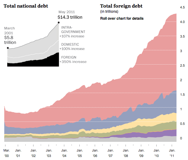
In May 2011, the United States owned $14.3 trillion in debt. A lot of that is money is owed to other countries. Heather Billings and Todd Lindeman of The Washington Post break foreign debt down by continent and then by country.
Foreign investors hold the largest share of the national debt. Estimated foreign holdings of U.S. Treasury securities have more than quadrupled since 2001. Some experts worry about the geopolitical consequences of foreign governments investing so deeply in U.S. Treasurys. But the investments also tie the fortunes of foreign governments more closely to those of the United States.
It's your standard interactive stacked area chart, except when you click on a layer in the initial view, which shows a break down by continent, you get a finer grained view with debt broken down by country. Instead of all the layers fading and reappearing on a selection, I would've liked to see a smoother transition like previous stacked charts, with country lines appearing at the end. This might help readers keep with the context better. Still good work though
The national debt data used in the charts above is for the United States’ total public debt outstanding, which includes the so-called intragovernmental holdings category, which mostly represents where surplus Social Security tax collections have gone since the early 1980s.
Click on the link in red to view many more detailed historical debt-related graphs at Seeking Alpha.
Interesting factoid to go along with this great data:
China, Japan, Germany, France, UK, Brazil, Italy
Those are the only 7 nations on the face of the Earth - outside the US - that have a GDP greater than our DEFICIT.
Yes, the GDP of 196 NATIONS on this Earth is less than our deficit. That includes Canada, who’s not only our biggest source of imported oil and our main trade partner, but - with a GDP of $1.57 trillion - has less economic activity than the borrowed money our Federal government is spending.
That’s simply insane.
Does this analysis include as debt the value of the Federal Reserve Notes (debt instruments) in circulation? How high will gold have to reach to secure the currency? (probably $3,000 to $10,000) If currency is not included and gold is applied to cover currency, wouldn’t the other debt then be unsecured?
Disclaimer: Opinions posted on Free Republic are those of the individual posters and do not necessarily represent the opinion of Free Republic or its management. All materials posted herein are protected by copyright law and the exemption for fair use of copyrighted works.