

Wow. That middle graph is a monetarist’s dream.
Can you say “Bubble?” 1999 - 2008. Housing.
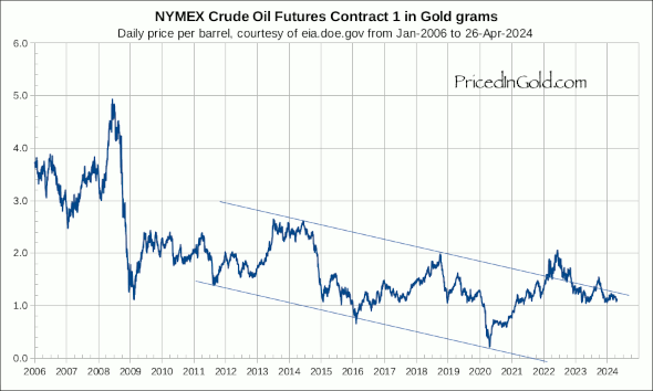
Now, we’re back to the comparatively low-inflationary norm of about 1.7 OZ of gold / barrel. Interesting.
Got any other good graphs for my continuing edumacation?