To: Lonesome in Massachussets
It's even worse when one looks at the raw CPI.
See how flat the red trend is during President Trump's term, and how steep it gets during Biden's term (green)?
This shows the cumulative effect of Biden's inflation since he took office. Biden's rate of change may be slowing down, but overall prices are way up since he took office.
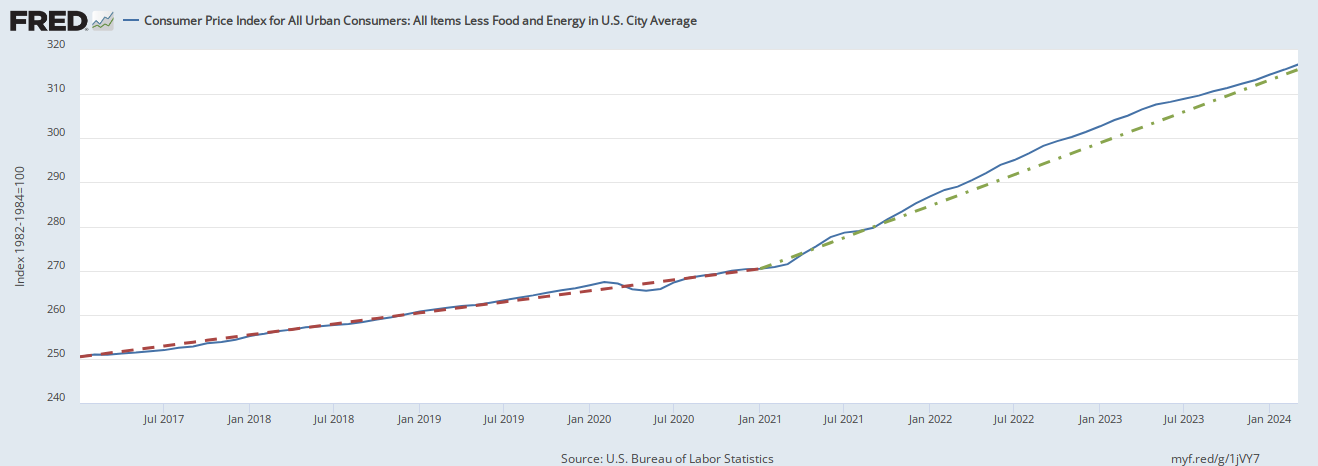
Red line: Inflation trend during Trump presidency.
Green line: Inflation trend during Biden presidency.
-PJ
46 posted on
04/11/2024 9:39:12 AM PDT by
Political Junkie Too
( * LAAP = Left-wing Activist Agitprop Press (formerly known as the MSM))
To: Political Junkie Too
That graph is great — really makes the point. I’d like to see the Republicans wave it around as we head into the election.
To: Political Junkie Too
That was the chart for "core inflation" that excludes housing and energy.
Here is the chart for all inflation. It's clear in this chart that even housing, oil, and gasoline inflation were normal during the Trump administration, but these economic sectors were even harder hit by Biden's inflation.

Red line: Inflation trend during Trump presidency.
Green line: Inflation trend during Biden presidency.
-PJ
49 posted on
04/11/2024 10:17:29 AM PDT by
Political Junkie Too
( * LAAP = Left-wing Activist Agitprop Press (formerly known as the MSM))
FreeRepublic.com is powered by software copyright 2000-2008 John Robinson