Well FWIW, I took a quick look around this Muller's site to get a sense of where he stands on the global warming "issue". He sortof gave tacit approval(since he didn't offer a rebuttal I was able to find) to the "Humans Are Killing the Planet" scam. That said, I think his graphs(with the exception of Fig. 1-6) are, well, kukka. Maybe(probably?) designed to obscure what's actually happening recently with world temps. JMO of course.
This set of graphs and following comments from HERE are a lot cleaner(fewer points I gather) and actually suggest a dip(???) from the latest peak on the 150kya(2nd) graph:
Temperatures over the last 1 million, 150 thousand, 16 thousand and 150 years
As we keep zooming in towards the present we keep seeing more detail: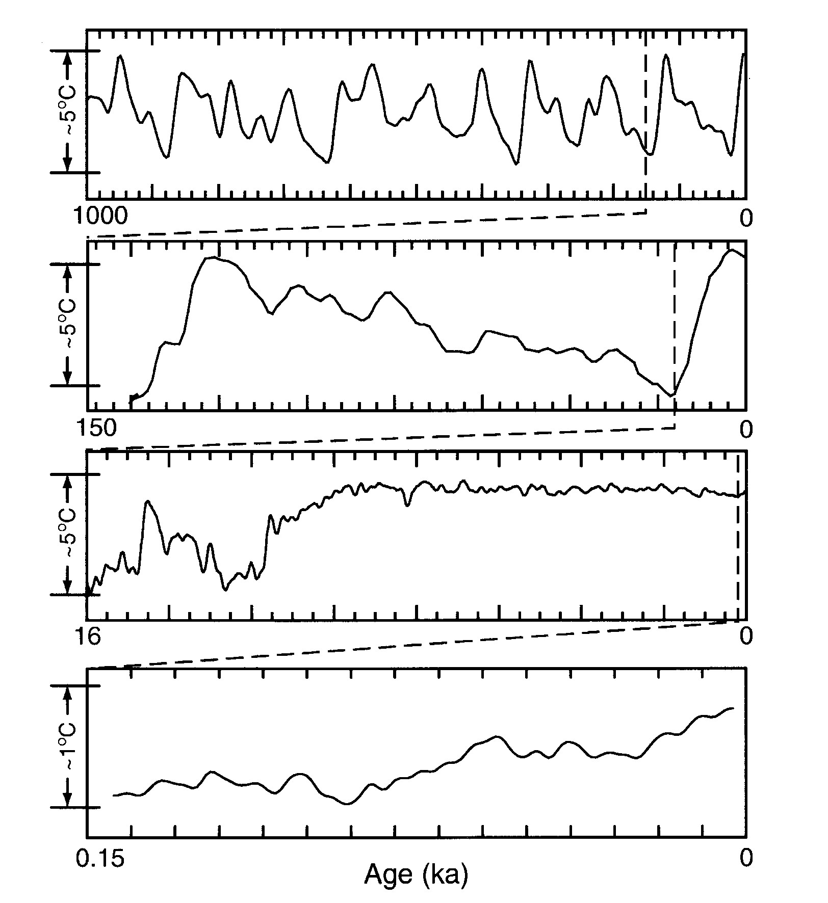
- Over the last million years there have been about ten Ice Ages - though counting Ice Ages is a bit like counting "really deep valleys" in a hilly landscape.
- From 150 to 120 thousand years ago it warmed up rather rapidly. From 120 thousand years ago to 16 thousand years ago it cooled down - that was the last Ice Age. Then it warmed up rather rapidly again.
- Over the last 10 thousand years temperatures have been unusually constant.

