Free Republic
Browse · Search
News/Activism
Topics · Post Article

To: nkycincinnatikid
Cherry-picking data remains a bad charting practice. Too often, it's just a means of hiding a bias.

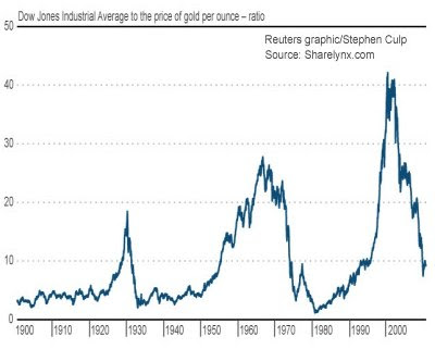
A far better chart would have shown continuous data (say a line chart, with annual data). The events mentioned in the article could have been marked by vertical lines, at the corresponding years. That would have put the data into context, and would prove that it wasn't simply cherry-picked. Also, continuous data would have provided some information regarding trends.

The thesis of the article may, or may not be right. The chart does nothing to advance it, and actually makes it less credible (because of the obvious cherry-picking).

18 posted on 03/29/2011 11:39:53 AM PDT by USFRIENDINVICTORIA
[ Post Reply | Private Reply | To 16 | View Replies ]


To: USFRIENDINVICTORIA; Beelzebubba; Black Agnes
This chart is more useful.


21 posted on 03/29/2011 6:51:14 PM PDT by Travis McGee (www.EnemiesForeignAndDomestic.com)
[ Post Reply | Private Reply | To 18 | View Replies ]

Free Republic
Browse · Search
News/Activism
Topics · Post Article


FreeRepublic, LLC, PO BOX 9771, FRESNO, CA 93794
FreeRepublic.com is powered by software copyright 2000-2008 John Robinson