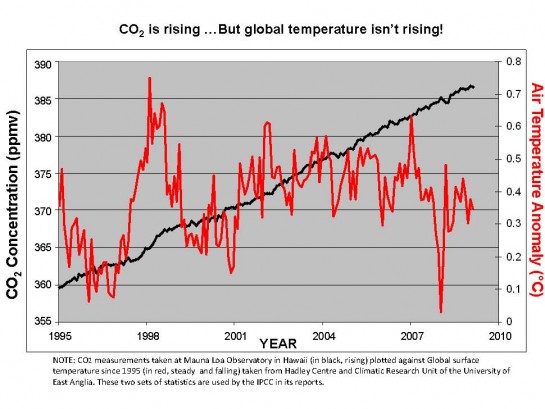
Just because it’s a(nother) pet peeve of mine: No credible scientist would/should publish a graph like that. The origin is surpressed for the CO2 scale, which wildly distorts it (i.e., makes the slope look a lot steeper than it actually is). Imagine the same data plotted on a scale that ranges from 0 to 400, and it would look almost flat (i.e., not scary “we’re all going to die” steep).