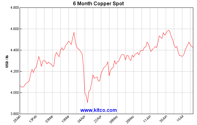
It's easy to make small-to-medium swings look like ZOMG EARTHSHAKING MOVEMENTS by compressing the vertical axis of the graph and showing only short term activity. The global warming gurus like to do this all them time.
A graph with a y-axis starting at zero and showing five years' history might well support a different narrative.