
Looks like roughly half of US cases are NY & environs?
bttt
I have not posted graphs in a while, but someone was asking about my data. I think that your daily thread is a great place to find good data and analysis, so I will direct that person here.
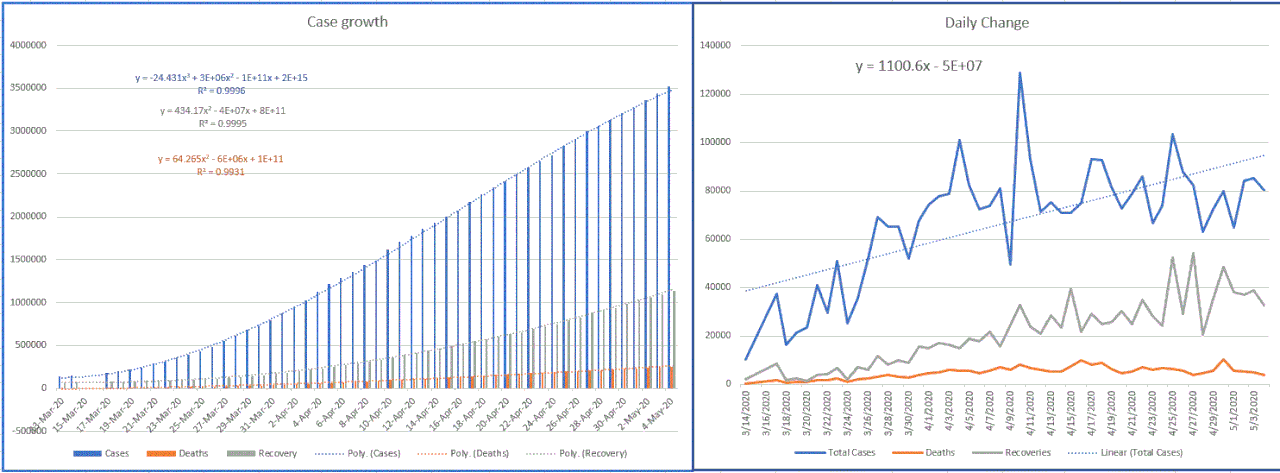
On this image, I combined two graphs (and cut off the right side of the right graph, oops). These are graphed from worldwide numbers using the data compiled by Johns Hopkins. The left graph shows that numbers of cases, deaths, and recoveries continue to increase. As the pandemic is brought under control, I expect to see these numbers level out, with the cases leveling first. This particular graph will never show a downslope, since it is an accumulative graph. The right graph shows the daily change in cases, deaths, and recoveries. What I look for here is a decrease in the slope of the line that is drawn through the data. This graph shows that the daily numbers are not increasing as rapidly as they were a few weeks ago, which is good. This means that the infection control measures are working.
Other good trends are in the death and recovery rates. The death rate peaked at 7.137% on May 1 but has dropped slightly so that it is 7.032% today. Some of the change results from the weekly reporting cycle, in which data is not collected consistently every day. This is because laboratories have weekly schedules, which affects the analysis of samples and reporting of results. The good thing is that the death rate seems to have stabilized near the 7% mark; it is not steadily increasing as it had done up until Apr 24. The recovery rate continues to increase. Almost 1/3 (32.134%) of Covid-19 patients have now recovered.
 z
z
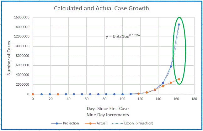
This graph is my modeling of disease growth, based on an R0 of 2.5 (this is how many people on average are infected by each sick person) and a round of infection lasting 9 days. The calculated numbers are in blue, and the real case numbers are in orange. Up until Apr 2, my model and the real case numbers matched quite well. However, by the next 9 day data point, the case numbers were falling off from what I had calculated. At the last data point collected on Apr 29, the difference between real and project had grown a lot, 14551915 projected vs. 3130191 actual. Or, the real number of cases was 21.5% of the projection. This is very good, since it shows how many cases would have resulted without quarantine measures, vs. how many are resulting now that quarantine policies have been in place for over a month. One of these days, I will revise the projections to highlight further changes in infection rates.
The reason I look at worldwide numbers rather than diving into details of specific places is because I am looking at the big picture. The pandemic is going to be problematic until it is controlled everywhere.