
Posted on 07/25/2013 5:19:55 PM PDT by Ernest_at_the_Beach
INTRODUCTION
I’ve received a number of emails and requests to comment on the recently released 3-part report from the UK Met Office titled “The Recent Pause in Global Warming”. See the UKMO webpage here. This is part 1, corresponding to part 1 of the UKMO report.
For additional discussions of the UKMO’s papers, see Bishop Hill’s post Your ship is sinking. Will spin help? and Judith Curry’s post UK Met Office on the pause.
The UKMO is offering the same old tired excuses. As a result, much of this post discusses topics and presents data that have addressed in past posts. In other words, parts of the following are simply rehashings of topics we’ve discussed previously. And as I try to do in many posts, I’ve saved the best for last: I don’t believe the UKMO wanted to show a slowing of ocean heat content during the last decade or so, since the early 2000s, but they did.
EXECUTIVE SUMMARY OF UKMO REPORT
The Executive Summary reads (my boldface):
A wide range of observed climate indicators continue to show changes that are consistent with a globally warming world, and our understanding of how the climate system works.
Global mean surface temperatures rose rapidly from the 1970s, but have been relatively flat over the most recent 15 years to 2013. This has prompted speculation that human induced global warming is no longer happening, or at least will be much smaller than predicted. Others maintain that this is a temporary pause and that temperatures will again rise at rates seen previously.
This paper is the first in a series of three reports from the Met Office Hadley Centre that address the recent pause in global warming and seek to answer the following questions. What have been the recent trends in other indicators of climate over this period; what are the potential drivers of the current pause; and how does the recent pause affect our projections of future climate?
Weather and climate science is founded on observing and understanding our complex and evolving environment. The fundamental physics of the Earth system provides the basis for the development of numerical models, which encapsulate our understanding of the full climate system (i.e. atmosphere, ocean, land and cryosphere), and enable us to make projections of its evolution.
It is therefore an inherent requirement that climate scientists have the best possible information available on the current state of the climate, and on its historical context. This requires highly accurate, globally distributed observations and monitoring systems and networks. This is also dependent on robust data processing and analysis to synthesise vast amounts of data, properly taking into account observational uncertainty resulting from both measurement limitations and observational gaps, in both space and time. Only through exercising due diligence and applying rigorous, unbiased, scientific assessment, can climate scientists provide the most complete picture on the state, trends and variability of the climate system’s many variables and phenomena. This provides the basis on which the science can advance the evidence and advice required by users.
This document provides a short synthesis of that global picture as it stands today. A fuller briefing is produced in conjunction with vast numbers of scientists each year, and published in a Special Supplement to the Bulletin of the American Meteorological Society (BAMS) (Blunden and Arndt, 2013).
The observations show that:
A wide range of climate quantities continue to show changes. For instance, we have observed a continued decline in Arctic sea ice and a rise in global sea level. These changes are consistent with our understanding of how the climate system responds to increasing atmospheric greenhouse gases.
Global mean surface temperatures remain high, with the last decade being the warmest on record.
Although the rate of surface warming appears to have slowed considerably over the most recent decade, such slowing for a decade or so has been seen in the past in observations and is simulated in climate models, where they are temporary events.
We’ll address each of the boldfaced portions.
THE PAUSE IS UNUSUAL FOR A WORLD WHERE GREENHOUSE GAS WARMING IS SUPPOSED TO HAVE DOMINATED SINCE THE MID-1970s
Let’s begin with the last paragraph of the Executive Summary:
Although the rate of surface warming appears to have slowed considerably over the most recent decade, such slowing for a decade or so has been seen in the past in observations and is simulated in climate models, where they are temporary events.
The UKMO appears to overlooking a couple of points. First, the Intergovernmental Panel on Climate Change (IPCC) presented what they claimed to be climate model-based evidence that only manmade greenhouse gases could have caused the warming over the past 30 years. Refer to their presentation and discussion of Figure 9.5 from their 4th Assessment Report. It’s reproduced here as Figure 1. It is from Chapter 9 Understanding and Attributing Climate Change, under Heading of “9.4.1.2 Simulations of the 20th Century”.
Figure 1
The accompanying text for the IPCC’s Figure 9.5 reads:
Figure 9.5 shows that simulations that incorporate anthropogenic forcings, including increasing greenhouse gas concentrations and the effects of aerosols, and that also incorporate natural external forcings provide a consistent explanation of the observed temperature record, whereas simulations that include only natural forcings do not simulate the warming observed over the last three decades.
The IPCC wanted the people of the world—and, more importantly, lawmakers—to believe that only manmade greenhouse gases could have explained the warming since the mid-1970s.
They then presented the forecasted rise in global surface temperatures based on projections of future greenhouse gas forcings. This was illustrated in Figure 10.4 from AR4, reproduced here as Figure 2.

Figure 2
Now the UK Met Office is saying that “such slowing for a decade or so has been seen in the past in observations and is simulated in climate models, where they are temporary events.” There are no decade-long pauses in projected global surface temperatures in Figure 2, for scenarios A2, A1B or B2. Global surface temperatures are, however, responding similarly to the “Constant Composition Commitment”, which according to the IPCC means “greenhouse gas concentrations are fixed at year 2000 levels.” Yet greenhouse gas concentrations continue to climb.
And the surface temperature record not only shows that “such slowing for a decade or so has been seen in the past in observations”, it also indicates that the pause can last for multiple decades. Refer to the observations data (black curves) in Figure 1. They show global surface temperatures pausing or declining from the early-1940s to the mid-1970s.
Does the UK Met Office think people have short memories or that we can’t read time-series graphs?
Second, public awareness of the pause in surface temperature warming skyrocketed with David Rose’s DailyMail article titled “Global warming stopped 16 years ago, reveals Met Office report quietly released… and here is the chart to prove it”. I updated David Rose’s graph in my response to the Royal Meteorological Society’s article by Kevin Trenberth, noting that surface temperatures in April 2013 were basically the same as they were in June 1997. Since then, I’ve used June 1997 as the start month for graphs of running 16-year trends that are updated and extended each month. The period is now 192-months long. Refer to the following graph of running 192-month trends from January 1880 to May 2013, Figure 3, using the HADCRUT4 global temperature anomaly product. The graph shows trends in global surface temperature anomalies—not the surface temperature anomalies. The last data point in the graph is the linear trend (in deg C per decade) from June 1997 to the most current month, May 2013. It is slightly positive, showing a warming rate of about 0.03 deg C/decade. That, of course, indicates global surface temperatures have warmed much slower than predicted by climate models during the most recent 192-month period. Working back in time, the data point immediately before the last one represents the linear trend for the 192-month period of May 1997 to April 2013, and the data point before it shows the trend in deg C per decade for April 1997 to March 2013, and so on. The last time global surface temperatures warmed at the minimal rate of 0.03 deg C per decade for a 192-month period was about 1980.

Figure 3
As noted in my post Open Letter to the Royal Meteorological Society Regarding Dr. Trenberth’s Article “Has Global Warming Stalled?”, Kevin Trenberth of NCAR presented period-averaged temperatures for 10-year periods in his article for the Royal Meteorological Society. He was attempting to show that the recent hiatus in global warming since 2001 was not unusual. Kevin Trenberth conveniently overlooked the fact that, based on his selected start year of 2001, the hiatus has lasted 12+ years, not 10.
The period from January 2001 to May 2013 is now 149-months long. Refer to Figure 4, which is a graph of running 149-month trends from January 1880 to May 2013, using the HADCRUT4 global temperature anomaly product. It was prepared similarly to the graph above, but in it, we’re presently the trends for 149-month periods in sequence. The highest recent rate of warming based on its linear trend occurred during the 149-month period that ended in late 2003, but warming trends have dropped drastically since then. Also note that the late 1970s was the last time there had been a 149-month period without global warming—until recently.
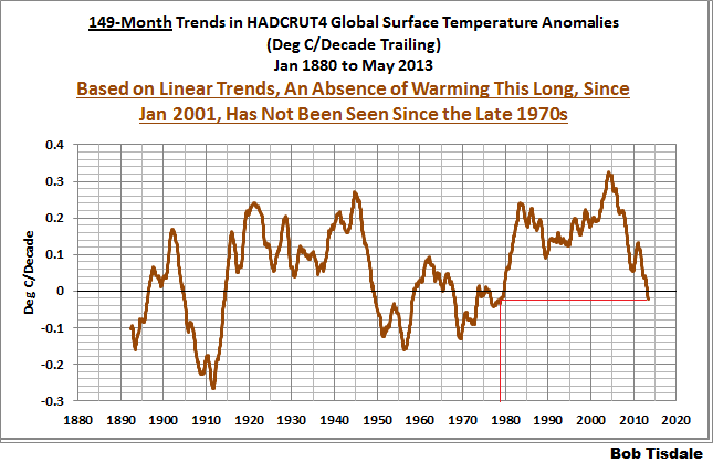
Figure 4
Bottom line: the recent hiatus in warming is unusual. We haven’t seen one since the late 1970s or 1980. And according to the IPCC’s climate models shown on their Figure 12.4 (my Figure 2), no hiatus was predicted.
Figures 3 and 4 are from the blog post June 2013 Global Surface (Land+Ocean) Temperature Anomaly Update.
DOES THE UKMO THINK GLOBAL SURFACE TEMPERATURES WILL MAGICALLY COOL?
Referring to the boldfaced quotes from the UKMO’s Executive Summary, they wrote:
Global mean surface temperatures remain high, with the last decade being the warmest on record.
Of course, “global mean surface temperatures have remain high…” Where has the UKMO stated that global surface temperatures should have cooled over the hiatus period? The UKMO appears to be grasping at straws.
And of course the last decade was the warmest on record. As noted in my Open Letter to the Royal Meteorological Society Regarding Dr. Trenberth’s Article “Has Global Warming Stalled?”, there are three natural events that caused the 1980s to be warmer than the 1970s, and caused the 1990s to be warmer than the 1980s, and caused the 2000s to be warmer than the 1990s.
The 1976 Pacific Climate Shift caused the sea surface temperatures of the East Pacific ocean to shift upwards about 0.22 deg C. See Figure 5. There are numerous peer-reviewed papers about that shift, but no overall agreement about the cause. Global surface temperatures around the globe responded to that shift through atmospheric bridges or teleconnections.

Figure 5
The sea surface temperatures of the Atlantic, Indian and West Pacific oceans (90S-90N, 80W-180) also show upward shifts. For these, though, we understand the causes. See Figure 6. Based on the period-average temperature anomalies, the 1986/87/88 El Niño caused the sea surface temperatures of the Atlantic, Indian and West Pacific to shift upwards by about 0.09 deg C. The sea surface temperatures for that region shifted upwards again about 0.18 deg C in response to the 1997/98 El Niño, and the 2009/10 El Niño appears to have caused a small upward shift of about 0.05 deg C.

Figure 6
The climate science community has elected to ignore those El Niño-caused upward shifts for two reasons: First, they suggest the sea surface temperatures for the global oceans warmed in response to naturally occurring events. Second, climate modelers even after decades of efforts still cannot simulate the processes of El Niño and La Niña properly.
And there are also two points that are blatantly obvious in Figure 6. First: The warming of the sea surface temperatures of the Atlantic, Indian and West Pacific oceans (or about 67% of the surface of the global oceans) depends on strong El Niño events. Or phrased another way, without those El Niño events, sea surface temperatures of the Atlantic, Indian and West Pacific oceans would show little to no warming. This, of course, suggests that the hiatus in global warming will continue until the next strong El Niño. Second: The La Niña events that trailed the El Niños of 1986/87/88, 1997/98 and 2009/10 did not have a proportional effect on the sea surface temperatures of the Atlantic, Indian and West Pacific oceans. Only the sea surface temperatures of the East Pacific ocean cool proportionally during those La Niñas, Figure 7, but sea surface temperatures there haven’t warmed in 31-plus years.
Figure 7
As I noted in the above-linked post about Trenberth’s article for the Royal Meteorological Society, if these naturally occurring, El Niño-induced upward shifts in sea surface temperatures are new to you, refer to my illustrated essay “The Manmade Global Warming Challenge” [42MB]. In it, I provide an introductory-level discussion of the natural processes that cause those upward shifts. Basically, the upward shifts are caused by the warm water that’s left over from the strong El Niño events—the warm water released by El Niños doesn’t magically disappear at the end of the El Niños. The essay also includes links to animated maps of data so that you can watch the upward shifts occur and so that you can understand how we know the leftover warm water exists. Most importantly, it will show you why La Niña and El Niño events should be looked on, not as noise in the instrument temperature record, but as a chaotic, naturally occurring recharge-discharge oscillator, with La Niñas acting as the recharge mode and with El Niños as the discharge mode. Sunlight, not infrared radiation, increases in the tropical Pacific during La Niñas. That is, data indicate the El Niños that caused the upward shifts were fueled by sunlight, not greenhouse gases. We’ll discuss this in more detail when we discuss ocean heat content data in a later post.
In that Trenberth-RMS post, I also presented a graph called the Alternate Presentation of Dr. Trenberth’s “Big Jumps” Chart. See Figure 8. I’ve started the graph in 1951 so that the response to the 1976 Pacific climate shift in the East Pacific is visible. And I’ve also altered the time periods to isolate the upward shifts associated with the 1986/87/88 and 1997/98 El Niño events. The natural contributions to the warming of global surface temperatures are blatantly obvious.
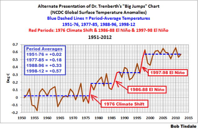
Figure 8
Now let’s look again at the UMKO quote we’ve been discussing under this heading.
Global mean surface temperatures remain high, with the last decade being the warmest on record.
Of course it was. It was the warmest on record because of the leftover warm water from the 1997/98 El Niño counteracted the effects of the trailing La Niña and caused the sea surface temperatures of the Atlantic, Indian and West Pacific Oceans to, in effect, shift upwards. Remember, the Atlantic, Indian and West Pacific oceans (90S-90N, 80W-180) cover a surface area of approximate 67% of the surface of the global oceans. Land surface air temperatures for much of the globe mimic the sea surface temperatures of the Atlantic, Indian and West Pacific oceans.
ON ARCTIC SEA ICE AND SEA LEVEL
Let’s move on to another boldfaced quote from the UKMO Executive Summary of Part 1:
A wide range of climate quantities continue to show changes. For instance, we have observed a continued decline in Arctic sea ice and a rise in global sea level. These changes are consistent with our understanding of how the climate system responds to increasing atmospheric greenhouse gases.
What the UKMO fails to note is that sea level would continue to rise regardless of our present surface temperatures. Let me quote an early paragraph from the introduction of my upcoming book (working title Climate Models are Crap). At present, it reads:
Sea level is also of interest, especially for those living along the coasts and on islands. Unfortunately, climate model outputs for sea level are not available in easy-to-use formats, so there are no model-data comparisons for sea level in this book. Regardless, many readers probably consider rising sea levels a done deal anyway. Sea levels have climbed 100 to 120 meters (about 330 to 390 feet) since the end of the last ice age, and they were also 4 to 8 meters (13 to 26 feet) higher during the Eemian (the last interglacial period) than they are today. (Refer to the press release for the 2013 paper by Dahl-Jensen et al Eemian interglacial reconstructed from a Greenland folded ice core.) Regardless of the cause…better said: regardless of whether or not we curtail greenhouse gas emissions, if surface temperatures remain where they are, or if they continue to warm, or even if surface temperatures were to cool a little in upcoming decades, sea levels will likely continue to rise. Refer to Roger Pielke, Jr.’s post How Much Sea Level Rise Would be Avoided by Aggressive CO2 Reductions? It’s very possible, before the end of the Holocene (this interglacial), sea levels could reach the heights seen during the Eemian. Some readers might believe it’s not a matter of if sea levels will reach that height; it’s a matter of when.
Roger Pielke, Jr.’s post (linked above) is worth a read.
With respect to Arctic sea ice, we first need to discuss sea surface temperatures. We’ve been illustrating and discussing for more than 4 years that the satellite-era sea surface temperature records indicate they warmed in response to naturally occurring events, not manmade greenhouse gases. Again, refer to essay “The Manmade Global Warming Challenge” [42MB] if this discussion is new to you. And we’ve also presented that the Pacific Ocean has a whole hasn’t warmed in almost 2 decades, as illustrated in Figure 9. (Figure 9 is from the post here.)

Figure 9
The left-hand map in Figure 10 presents the annual trends in Pacific sea surface temperatures from 1982 to 2012. We can see that some portions have warmed over that period, especially in the central and western mid-latitudes of the North Pacific. However, if we look at the quarterly trends for the peak Arctic sea ice melt season, July through September, the warming rates are quite high in portions of the high latitudes of the North Pacific. Those are shown in the right-hand map.
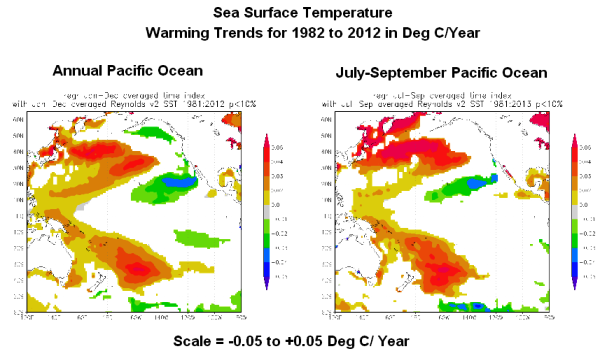
Figure 10
We’ve also discussed that the sea surface temperatures of the North Atlantic have an additional mode of natural variability called the Atlantic Multidecadal Oscillation. (For further information about the Atlantic Multidecadal Oscillation, refer the NOAA/AOML FAQ webpage here, and to my blog post here and my introduction to the AMO here.) As a result, since the mid-1970s, the North Atlantic warmed naturally at a rate that was greater than the rest of the global oceans, which have also warmed in response to natural events, not manmade greenhouse gases.
But, as shown in the map of the annual trends of the North Atlantic (the left-hand map in Figure 11), the majority of the warming there took place at high latitudes. And that’s also especially true during the peak Arctic sea ice melt season of July through September, shown in the right-hand map.

Figure 11
Of the high latitudes of the North Atlantic and North Pacific, the North Atlantic sea surface temperatures clearly had the higher warming rate as a result of the Atlantic Multidecadal Oscillation.
That leads to our discussion of Arctic sea ice. We discussed the impact on sea ice extent of a number of sea surface temperature, lower troposphere temperature and land surface air temperature datasets in the post How Much of an Impact Does the Atlantic Multidecadal Oscillation Have on Arctic Sea Ice Extent? Of the datasets presented, the one with the greatest agreement–the highest correlation–with sea ice extent was the sea surface temperature anomalies of the high latitudes of the Northern Hemisphere (60N-90N). See Figure 12. The Arctic sea ice extent and the sea surface temperatures at the high latitudes of the Northern Hemisphere had reasonably high correlation coefficient: 0.85. The correlations of Arctic sea ice area extent with lower troposphere temperature anomalies and land surface air temperature anomalies (both at high latitudes: 60N-90N) were far lower.

Figure 12
As noted at the end of that post:
Since there is no evidence of a manmade component in the warming of the global oceans over the past 30 years, the natural additional warming of the sea surface temperature anomalies of the North Atlantic—above the natural warming of the sea surface temperatures for the rest of the global oceans—has been a major contributor to the natural loss of Arctic sea ice over the satellite era. Add to that the weather events that happen every couple of years and we can pretty much dismiss the hubbub over this year’s [2012] record low sea ice in the Arctic basin.
CLIMATE MODELS
Let’s discuss another of the boldfaced quotes from the Executive Summary of the UKMO report. They wrote:
The fundamental physics of the Earth system provides the basis for the development of numerical models, which encapsulate our understanding of the full climate system (i.e. atmosphere, ocean, land and cryosphere), and enable us to make projections of its evolution.
We’ve illustrated in a number of posts over the past few months that the climate models prepared for the IPCC’s upcoming 5th Assessment show no skill at being able to simulate:
And we recently illustrated and discussed in the post Meehl et al (2013) Are Also Looking for Trenberth’s Missing Heat that the climate models used in that study show no evidence that they are capable of simulating how warm water is transported from the tropics to the mid-latitudes at the surface of the Pacific Ocean, so why should we believe they can simulate warm water being transported to depths below 700 meters without warming the waters above 700 meters?
The climate science community may believe they understand “the fundamental physics of the Earth system”, but the performance of their models indicate their understandings are very limited and that they have a long way to go before they can “make projections of its evolution”. If they can’t simulate the past, we have no reason to believe their projections of what the future might hold in store.
A QUICK NOTE ABOUT OCEAN HEAT CONTENT
The UKMO has this to say about ocean heat content (my boldface):
Since about 2000, the Argo array of autonomous robotic ocean profiling floats has led to near global coverage with measurements of temperature to 700m (15-20% of the average open ocean depth), with more recent buoys measuring down to 2,000m (the upper 50%). However, the ice-covered and marginal seas still remain a technical challenge. Combining data from the Argo array with XBT and ship measurements, enables relatively long estimates of the heat stored in the upper 700m to be made (Figure 18). Comparing this record to the surface temperature record shows that, despite the surface warming pause since 2000, the ocean heat content in the upper ocean continued to rise.
Figure 18 from UKMO report is presented in the top cell of my Figure 13. I’ve lightened much of the surface temperature data to help highlight the ocean heat content data. The UKMO didn’t identify the ocean heat content dataset for the depths of 0-700 meters; they only indicated in the caption that the surface temperature data is HADCRUT4. In the text of their report, the UKMO referred to Levitus et al (2012). But the top cell in Figure 13 (Figure 18 from the UKMO report) is not the NODC ocean heat content data for 0-700 meters. The NODC ocean heat content data for 0-700 meters does not cool from the late 1980s to 2000 as the UKMO has presented.

Figure 13
The bottom cell of my Figure 13 is also a graph of ocean heat content data from the UKMO report. It was included as cell W of their Figure 1. The UKMO notes that it is from the “State of the Climate in 2012”, Bulletin of the American Meteorology, Blunden and Arndt (2013). That report is in press so we can’t track down the sources of the ocean heat content data.
As you’ll note in that lower graph, 3 of the 4 unidentified ocean heat content datasets for 0-700 meters show that the warming of the oceans slowed to a crawl, starting in the early 2000s. Those three ocean heat content datasets contradict the UKMO’s statement that “…despite the surface warming pause since 2000, the ocean heat content in the upper ocean continued to rise.”
CLOSING
I’ll have to agree with the title of Bishop Hill’s post about the UKMO report: Your ship is sinking. Will spin help?
We’ll take a look at Part 2 of their report in a few days. In the mean time, I’m going back to writing Climate Models are Crap.
15 Years is “recent”.
OK!! Everybody pay attention!
Lesson for today:
1. The sun is 1,300,000 times as big as the earth.
2. The sun is a ball of fire that controls our climates.
3. The earth is a rock.
4. The earth is a speck in comparison to the size of the sun.
5. Inhabitants of the earth are less than specks.
Study Question: How do less-than-specks in congress plan to control the sun?
“15 Years is “recent”
Not even a blink of the eye, in terms of climate change.
That is very true.
None of this matters to the environazi’s.
They hate people.
They are clueless, but very passionate. Like little children screaming to get their way.
I engaged in a conversation about C02 with this stranger at a bar years ago. When I told her that C02 was plant food and it only made up less than 4 parts per million in the atmosphere she seemed to accept that as factual. Then I called C02 “Carbon Dioxide” and she got really upset. She then tried to tell me the debate was not about “Carbon Dioxide” but “Carbon Monoxide”. A clueless idiot that became so completely unhinged that I had to leave.
You can’t debate with someone that is irrational.
In addition.
They love the “Hockey Stick” graph that Gore used in his movie. That had a huge impact on this whole thing.
If anybody has a chance, show them the “Hockey Stick” graph of our national debt without telling them what it is at first.
Do you think they will care ?
One can only wonder how many Russian and other ships will get locked in for months this winter in the Arctic Ocean and lower bearing straights areas. :)
In terms of natural millennial change due (primarily) to solar activity, true.
But the Global Warming-ists have assured us that our V8 engines will cook us in mere years.
Indeed they have — and the Warming-ists haven’t hesitated to use every variation in climate trends (no matter how brief) as “proof” of global warming. They were wrong, of course; and it is very tempting to use their “logic” against them, now that the trend has reversed. However, the only thing we can really conclude, from the recent “pause” (or is it a “reversal”?) in warming, is that their computer models were wrong.
Disclaimer: Opinions posted on Free Republic are those of the individual posters and do not necessarily represent the opinion of Free Republic or its management. All materials posted herein are protected by copyright law and the exemption for fair use of copyrighted works.
