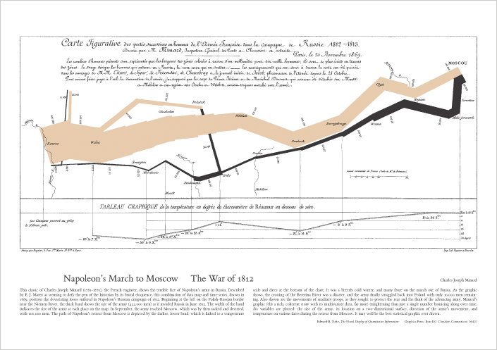
His now classic graph of Napoleons March to Russia is a tour de force of the sheer amount of data displayed in a single graph. The first edition was accompanied by a poster of that graph.
Posted on 07/08/2017 6:20:54 AM PDT by Sir Napsalot
We used to be more skeptical of what other people were trying to peddle, now we just don't have enough time to spot the 'misleading'.
I think it is funny that early in the video, the narrator describes the use of changing values along the x or y axis to make the charted data seem more significant. The example was a graph showing the reliability of Chevy trucks seemed to show that Chevy is twice as reliable as Toyota and several times more than Nissan—but the graph really shows that they are all better than 95% reliable, and there is only a ~3% difference in reliability between the most and least reliable. But then, at the end, the narrator explains that an ocean temperature graph showing little change since 1880 is misleading because it *didn’t* change the scale to exaggerate the change.
If you want to determine how graphing techniques can be manipulated, you have to apply the same standards across the board.
You can’t have it both ways.
Learned all this in 4th and 5th grade, back in early ‘60s. Shame the kiddies aren’t educated as well today.
The natural disposition is always to believe. It is acquired wisdom and experience only that teach incredulity, and they very seldom teach it enough. The wisest and most cautious of us all frequently gives credit to stories which he himself is afterwards both ashamed and astonished that he could possibly think of believing.So the way to tell if someone is trying to convince you of something is to look and see if their lips are moving.The man whom we believe is necessarily, in the things concerning which we believe him, our leader and director, and we look up to him with a certain degree of esteem and respect. But as from admiring other people we come to wish to be admired ourselves; so from being led and directed by other people we learn to wish to become ourselves leaders and directors . .
The desire of being believed, the desire of persuading, of leading and directing other people, seems to be one of the strongest of all our natural desires. - Adam Smith, Theory of Moral Sentiments (1759)
Skepticism is the golden mean between naïveté and cynicism. Enough to often, at least, avoid afterwards being both ashamed and astonished that we could possibly think of believing” a positive assertion - and not enough to eliminate “faith, hope and love."
Look for the CNN logo?
Stock performance graphs on CNBC. They always skew the value scale to make any change look huge.
His now classic graph of Napoleons March to Russia is a tour de force of the sheer amount of data displayed in a single graph. The first edition was accompanied by a poster of that graph.
I had to rewind to see the oceanic temp graphs twice to get a sense, too.
While the overall oceanic temp didn’t change too much from 1880 to 2016, but the second graph showed the Celcius deg change from year to previous year (change between -1 to +1 deg).
The graph does not explain how and why the change (no cause) from this short presentation, but I guess we’ll need to dig deeper in which the original graph was created.

You're welcome.
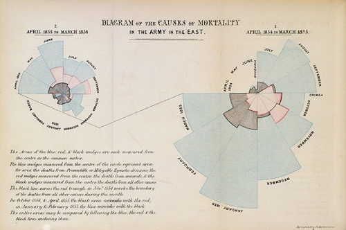
Let to significant changes in military medical care
LOL, I am totally (unashamed) stealing it.
“But then, at the end, the narrator explains that an ocean temperature graph showing little change since 1880 is misleading because it *didn’t* change the scale to exaggerate the change.”
Also note the 2 graphs compared different things. The first was actual ocean temp and the second was temperature “anomaly”. The anomaly graph seems to show unusually low temps in the 1800s gradually changing to increasing temps. The question is, what caused the anomalous low temps prior to large scale industrialization and autos?
Bfl
If a graph is being used to convince you of something it’s false. There are lies, damned lies, statistics, and graphs.
I was just going to point out the same thing but you beat me to it. Good eye. Recent ocean temperatures easily falls within the range of normal temperatures.
I use graphs a lot. All of the points in the article are pretty basic stuff. Heck, the chevy truck type of manipulation was one I learned about in high school in 1970.
And has anybody seen the youtube video showing the Climate change “hockey stick” when inserted into the graph of hundreds of thousands of years of data? It’d comical. And that is even assuming the hockey stick itself was not manipulated in the first place.
Exactly what I saw. The long time series showed that we are within the normal variation. The some time series suggests we are outside the normal range of variation.
But, it’s for climate change. As the faculty of Penn State have decided in the case of Michael Mann, it’s is o.k. to withhold data that contradicts the theory of catastrophic global warming. Hence, Mann-made global warming.
save for later
Disclaimer: Opinions posted on Free Republic are those of the individual posters and do not necessarily represent the opinion of Free Republic or its management. All materials posted herein are protected by copyright law and the exemption for fair use of copyrighted works.