These are stripes, black and white, made on unprimed canvas with the help of masking tape. To me, they make the subtle colors and edges of Rothko move a great deal more.
Posted on 05/08/2006 6:05:20 AM PDT by Republicanprofessor
This post encapsulates both my perceptions of this article and this "artist's" "work." "If you really do want to know more about the form and content of Rothko's work, check out my home page for clickable "classes" on many periods in art history." I don't. I don't want to know any more about the form and content of this drek. blocks of color. So What? "I could take a crap in a box and call it guaranteed..." It is like calling John Cage's musical maunderings (calling them musical is suspect) evocative, or that himbo that hung sheets all around central park a sculptor. "Art that requires a learned dissertation to appreciate has failed as art." Prion has the right idea here. If a reasonably educated, reasonably interested human cannot perceive what you are trying to present with an artistic offering, you have probably offered it up to your oh-so-sensitive cronies. You now deserve every cocked head, scratched head, and derisive, scornful snort provided by those reasonable and interested folk. Top sends Top sends' art commentary can be found aperiodically on the Free Republic.
Woa! Watch out for spell check, it yanks every bit of formatting out of a post.
Saw that too. Nice curve and taper.
Rothko's "art" is the glorification of paint chips.
Really? Wasn't your 'unformatted' post really railing against the self-limited window of perception that so many of us share?
I'm afraid you've been hanging around the arty crowd too long. Is it because of your profession, Professor?
The viewer of such hokum, if he is an initiate, is obligated to generate the appropriate emotional response. So he does, or else simulates it. Otherwise, he feels left out of the "smart set."
Read "the Painted Word" again.
What excellent advice! Good heavens, I haven't thought of that book in years. I wonder if I still have a copy?
I'll never forget the "impastometer"! Hahaha.
I was thinking drivel.
This snip is from you:
From the Seagram images on line, I had never liked that series as much as his other blocks. But now I am beginning to reconsider after reading this article.
IMO, this represents the whole problem laid out by Wolfe: "I didn't like that piece of art, then I read an article, and now I undertand why I am supposed to like it. So I do."
Real art does not require this sort of effort. I see this stuff as insecurity on the viewer's part -- "I want to be cool and like the stuff the cool kids like. But I don't get it. I don't like it. Oh! This article will help me rationalize why I ought to like it. Now I can hang with the cool crowd and say "I like it too. It speaks to me of the artist's angst and his view of mankind. The red says "swords" to me, don't you think?"
It's a con game.
I have put up a webpage of classes dealing with petro45ACP's posts.
Suffice to say that in his "spellchecked" phase he is seeking the concretization of no state that is without the limits of western reason. His posts submit to Western syncretic forms, following the esoteric, extra-sensory limits of the keyboard bindings on his computer. The essential paraclasm in his work categorically subsists in the moment when lexical order is imposed from above - in the form of a "spell checker" - when his cognitive expression is reduced to so much ascii gibberish.
< Art Critic OFF>
Modern art is all about who is kidding who
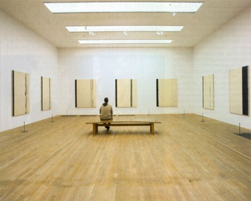
I don't get a gut reaction to colors, unless there is a context. There is no context in the museum (look at how empty the room is!) so I don't get a gut reaction.
Different strokes for different folks. I love Rothko, but I don't love every other famous modern artist. (Twombly in my opinion is filthy childish grafitti, for instance, and Rauschenberg does nothing for me.)
All of the above is said to establish that I recognize the need for words and the legitimacy of the abstract. However, there is a line that I believe Rothko and many others have crossed. That line is where the words supporting the art are more important than the art itself. The paintings by themselves (in my opinion) have little to offer other than the fact that they are big and red.
I think the bench actually helps to balance the two pictures. The suit the lady wears is a bit baggy though.
Bingo.
More time and money than sense and talent.
These are stripes, black and white, made on unprimed canvas with the help of masking tape. To me, they make the subtle colors and edges of Rothko move a great deal more.
Well said, thank you.
Disclaimer: Opinions posted on Free Republic are those of the individual posters and do not necessarily represent the opinion of Free Republic or its management. All materials posted herein are protected by copyright law and the exemption for fair use of copyrighted works.