These are stripes, black and white, made on unprimed canvas with the help of masking tape. To me, they make the subtle colors and edges of Rothko move a great deal more.
Posted on 05/08/2006 6:05:20 AM PDT by Republicanprofessor
As Tate Modern unveils its new Rothko Room, Booker Prize-winning novelist John Banville reveals the story behind the paintings it contains, and reflects on one of the most compelling experiences to be had in any gallery in the world.
In 1959, while travelling in southern Italy with his family and that of magazine editor, John Hurt Fischer, Mark Rothko discovered a surprising classical precursor to his contemporary art…
A room full of violence, and the silence of death (Filed: 06/05/2006)
As Tate Modern unveils its new Rothko Room, Booker Prize-winning novelist John Banville reveals the story behind the paintings it contains, and reflects on one of the most compelling experiences to be had in any gallery in the world
In 1959, while travelling in southern Italy with his family and that of magazine editor, John Hurt Fischer, Mark Rothko discovered a surprising classical precursor to his contemporary art…
Red on Maroon (1959) by Mark Rothko, who said: 'I hope to paint something that will ruin the appetite of every son of a bitch who ever eats in that room'
On the journey down from Naples the party had fallen in with a couple of Italian youths who offered to act as guides. At Paestum, where the odd-assorted little band picnicked at noon in the Temple of Hera, the young men expressed their curiosity as to the identity and occupations of the Americans. Fischer's daughter, who was acting as interpreter, turned to Rothko and said: "I have told them that you are an artist, and they ask whether you came here to paint the temples," to which c replied: "Tell them that I have been painting Greek temples all my life without knowing it."
The set of colossal canvases housed in Tate Modern's Rothko Room originated, as every art-aware schoolboy knows, in a commission for the Four Seasons restaurant in the Seagram Building on New York's Park Avenue. The commission, one of the more remarkable instances of incongruity in the history of art patronage, was for 600 square feet of mural-sized paintings to decorate the walls of the restaurant - "a place," according to Rothko, "where the richest bastards in New York will come to feed and show off " - although it is not clear if Rothko realised from the outset that his paintings were intended as a backdrop for fine dining. The architect Philip Johnson, who assisted Mies van der Rohe in the design of the building and who was chief commissioner of the Rothko murals, always insisted that the painter knew that they were to be hung in the restaurant.
Great art can be fitted into the oddest places - on a chapel ceiling, for instance, or in a millionaire's bathroom - but it does seem remarkably brave on Johnson's part to call on Rothko, one of the most uncompromising of the Abstract Expressionists (a label Rothko vigorously rejected), to soothe the savage breasts of New York's richest bastards and their mates.
Rothko himself was straightforward, at least in private, about his motives in taking on the Seagram commission. He told John Fischer: "I accepted this assignment as a challenge, with strictly malicious intentions. I hope to paint something that will ruin the appetite of every son of a bitch who ever eats in that room. If the restaurant would refuse to put up my murals, that would be the ultimate compliment. But they won't. People can stand anything these days."
Back in New York, Rothko and his wife went to dinner at the Four Seasons, and in the spring of the following year he returned Seagram's $35,000 fee and withdrew from the commission. One supposes that his experience that night of the restaurant and its rich and powerful diners turned his artistic stomach. Eventually, he decided instead to donate the paintings to Tate.
This transaction was also to prove fraught, for Rothko, despite, or, as is more likely, because of the great critical and commercial success that had come to him in the 1950s, tended to detect slights and veiled insults at every turn. After a visit to London in 1966 to discuss "the gift of some of my pictures to the Tate", he wrote in icy fury to Norman Reid, the Tate director: "Your complete personal neglect of my presence in London, and your failure to provide adequate opportunities for these discussions, poses for me the following question: Was this simply a typical demonstration of traditional English hospitality, or was it your way of indicating to me that you were no longer interested in these negotiations?" Reid himself said that he had been waiting for Rothko to approach him, worrying that otherwise he might put off the notoriously prickly artist by seeming too eager.
Compression: rehanging Tate Modern's new Rothko Room
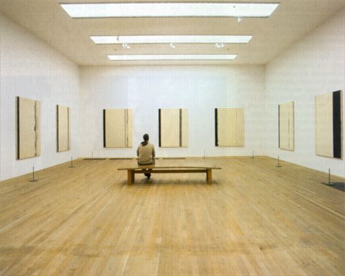
In the end, as we know, artistic feathers were smoothed and the Rothko Room opened at Tate in 1970. Rothko knew exactly in what way he wanted the pictures hung and lit. In a list of "suggestions" to the Whitechapel Gallery for a 1961 show of his work, he had stipulated how the walls should be coloured - "off-white with umber and warmed by a little red" - and said the pictures should be hung "as close to the floor as possible, ideally no more than six inches above it" in a room with ordinary daylight, since it was in daylight that they were painted. As we can see in the Rothko Room, the Tate Gallery and now Tate Modern followed these instructions to the last detail.
The room is one of the strangest, most compelling and entirely alarming experiences to be had in any gallery anywhere. What strikes one on first entering is the nature of the silence, suspended in this shadowed vault like the silence of death itself - not a death after illness or old age, but at the end of some terrible act of sacrifice and atonement. In the dimness the paintings appear at first fuzzy, and move inside themselves in eerie stealth: dark pillars shimmer, apertures seem to slide open, shadowed doorways gape, giving on to depthless interiors.
Gradually, as the eye adjusts to the space's greyish lighting - itself a kind of masterwork - the colours seep up through the canvas like new blood through a bandage in which old blood has already dried. The violence of these images is hardly tolerable - as Rilke has it: "Beauty's nothing/ but beginning of Terror we're still just able to bear."
Here we are in the presence not of religion, but of something at once primordial and all too contemporary. On a notecard from the 1950s, Rothko had written, in his usual clotted style that yet makes his meaning entirely clear:
"When I say that my paintings are Western, what I mean is that they seek the concretization of no state that is without the limits of western reason, no esoteric, extra-sensory or divine attributes to be achieved by prayer & terror. Those who can claim that these [limits] are exceeded are exhibiting self-imposed limitations as to the tensile limits of the imagination within those limits. In other words, that there is no yearning in these paintings for Paradise, or divination. On the contrary they are deeply involved in the possibility of ordinary humanity."
In a way, the murals would have suited the Four Seasons, one of those modern-day temples and Houses of Mysteries where the sons of man - and sons of bitches - feed daily upon the blood sacrifice of their own ferocious, worldly triumphs.
This post encapsulates both my perceptions of this article and this "artist's" "work." "If you really do want to know more about the form and content of Rothko's work, check out my home page for clickable "classes" on many periods in art history." I don't. I don't want to know any more about the form and content of this drek. blocks of color. So What? "I could take a crap in a box and call it guaranteed..." It is like calling John Cage's musical maunderings (calling them musical is suspect) evocative, or that himbo that hung sheets all around central park a sculptor. "Art that requires a learned dissertation to appreciate has failed as art." Prion has the right idea here. If a reasonably educated, reasonably interested human cannot perceive what you are trying to present with an artistic offering, you have probably offered it up to your oh-so-sensitive cronies. You now deserve every cocked head, scratched head, and derisive, scornful snort provided by those reasonable and interested folk. Top sends Top sends' art commentary can be found aperiodically on the Free Republic.
Woa! Watch out for spell check, it yanks every bit of formatting out of a post.
Saw that too. Nice curve and taper.
Rothko's "art" is the glorification of paint chips.
Really? Wasn't your 'unformatted' post really railing against the self-limited window of perception that so many of us share?
I'm afraid you've been hanging around the arty crowd too long. Is it because of your profession, Professor?
The viewer of such hokum, if he is an initiate, is obligated to generate the appropriate emotional response. So he does, or else simulates it. Otherwise, he feels left out of the "smart set."
Read "the Painted Word" again.
What excellent advice! Good heavens, I haven't thought of that book in years. I wonder if I still have a copy?
I'll never forget the "impastometer"! Hahaha.
I was thinking drivel.
This snip is from you:
From the Seagram images on line, I had never liked that series as much as his other blocks. But now I am beginning to reconsider after reading this article.
IMO, this represents the whole problem laid out by Wolfe: "I didn't like that piece of art, then I read an article, and now I undertand why I am supposed to like it. So I do."
Real art does not require this sort of effort. I see this stuff as insecurity on the viewer's part -- "I want to be cool and like the stuff the cool kids like. But I don't get it. I don't like it. Oh! This article will help me rationalize why I ought to like it. Now I can hang with the cool crowd and say "I like it too. It speaks to me of the artist's angst and his view of mankind. The red says "swords" to me, don't you think?"
It's a con game.
I have put up a webpage of classes dealing with petro45ACP's posts.
Suffice to say that in his "spellchecked" phase he is seeking the concretization of no state that is without the limits of western reason. His posts submit to Western syncretic forms, following the esoteric, extra-sensory limits of the keyboard bindings on his computer. The essential paraclasm in his work categorically subsists in the moment when lexical order is imposed from above - in the form of a "spell checker" - when his cognitive expression is reduced to so much ascii gibberish.
< Art Critic OFF>
Modern art is all about who is kidding who
I don't get a gut reaction to colors, unless there is a context. There is no context in the museum (look at how empty the room is!) so I don't get a gut reaction.
Different strokes for different folks. I love Rothko, but I don't love every other famous modern artist. (Twombly in my opinion is filthy childish grafitti, for instance, and Rauschenberg does nothing for me.)
All of the above is said to establish that I recognize the need for words and the legitimacy of the abstract. However, there is a line that I believe Rothko and many others have crossed. That line is where the words supporting the art are more important than the art itself. The paintings by themselves (in my opinion) have little to offer other than the fact that they are big and red.
I think the bench actually helps to balance the two pictures. The suit the lady wears is a bit baggy though.
Bingo.
More time and money than sense and talent.
These are stripes, black and white, made on unprimed canvas with the help of masking tape. To me, they make the subtle colors and edges of Rothko move a great deal more.
Well said, thank you.
Disclaimer: Opinions posted on Free Republic are those of the individual posters and do not necessarily represent the opinion of Free Republic or its management. All materials posted herein are protected by copyright law and the exemption for fair use of copyrighted works.