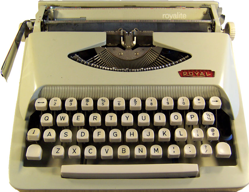
I gotta go with the typewriter being used HAD A “1” KEY, and for what ever reason the person typing this happened to use the “1” key for the 1st line then after that habit typing took over and they used the lower case “l”.
I’ve come across a few popular 1960 era typewriters that have the “1”
http://www.mrmartinweb.com/type.htm#triumph
http://www.mrmartinweb.com/type.htm#brother

That is certainly possible. But as an old typist, I can tell you that the hands do the typing, not the mind. Your hands get into a pattern to use the lower case "l" key for a one and the upper case "O" key for a zero, and it is a hard habit to break just because you suddenly have a nifty, new typewriter with a "1" key and a "0" key...
But even more telling is that the typeface of that spurious "1" character does not match the typeface of the rest of the characters in the set. All the others have serifs while that "1" does not. A serif is the decorative grace line added to letters or characters such as the footer seen on this "1"—which actually are more than just decorations because they make it easier to follow a line of print. That "1" without the footer belongs to an entirely different typeface... which is a big red flag that the Australian BC is bogused up in some way and the forger made an error. The "1" that should have accompanied this typeface would have looked similar to the lower case "l" but would have had the slanted flag that IS on that "1".