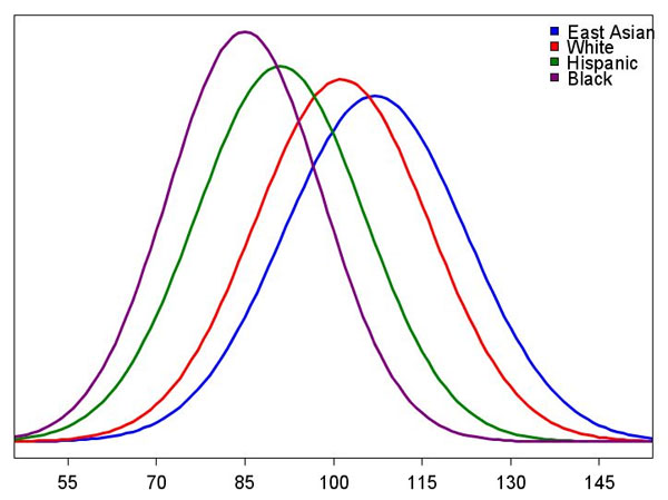
This chart (backed up by incredible amounts of empirical data) really seems to get under the skin of these “activists.”
Maybe because it’s a fake graph. What is the “Y” axis? Hispanic is not a race.
One problem with Murray’s graph is that Hispanics are a “polyglot” of races. Another is that all the racial groupings are somewhat arbitrary as to who actually fits in each classification. Finally, you can’t use such a generalized graph to imply the IQ of any specific individual.