Free Republic
Browse · Search
News/Activism
Topics · Post Article

To: blam
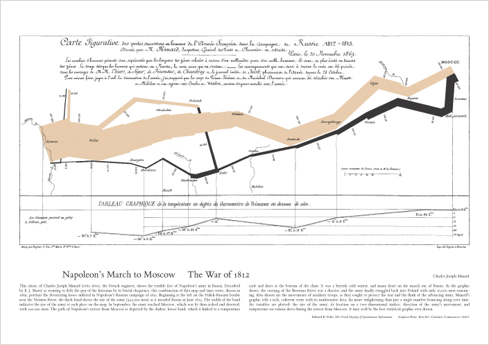
Probably the best statistical graphic ever drawn, this map by Charles Joseph Minard portrays the losses suffered by Napoleon's army in the Russian campaign of 1812. Beginning at the Polish-Russian border, the thick band shows the size of the army at each position. The path of Napoleon's retreat from Moscow in the bitterly cold winter is depicted by the dark lower band, which is tied to temperature and time scales.


9 posted on 12/15/2005 5:52:50 PM PST by ClearCase_guy
[ Post Reply | Private Reply | To 1 | View Replies ]


To: ClearCase_guy
"Probably the best statistical graphic ever drawn, this map by Charles Joseph Minard portrays the losses suffered by Napoleon's army in the Russian campaign of 1812. "

Yup. I've stared at that for a long time on several occasions.

11 posted on 12/15/2005 5:56:56 PM PST by blam
[ Post Reply | Private Reply | To 9 | View Replies ]

To: ClearCase_guy

Notice however that virtually all of the decline takes place on the inward journey, when it was still summer. The reality is most of the losses came from desertion caused by inability to supply so large a force. He could not move rations from his stockpiles to the army efficiently, because it was advancing rapidly and his supply of horses was quite limited. They died first. Men trying to live off the land found it practically uninhabited compared to what they were used to in western Europe, and strayed far from the main body looking for food. Often as not, they found cossacks instead.


15 posted on 12/15/2005 6:46:35 PM PST by JasonC
[ Post Reply | Private Reply | To 9 | View Replies ]

Free Republic
Browse · Search
News/Activism
Topics · Post Article


FreeRepublic, LLC, PO BOX 9771, FRESNO, CA 93794
FreeRepublic.com is powered by software copyright 2000-2008 John Robinson