Free Republic
Browse · Search
News/Activism
Topics · Post Article

To: amorphous

World of Meters is good. There’s a map at Reuters that gets more behind on publishing data in some places than others.

https://graphics.reuters.com/HEALTH-CORONAVIRUS-USA/0100B5K8423/index.html

The following is good. Don’t let the big numbers or ethnic group turn you away. They use software to gather data that’s more directly from sources around the country. Their data is used by other offices including the CDC. It all comes out on other sites about three days later, give or take. It’s administered by Chinese-Americans.

https://coronavirus.1point3acres.com/en

I find some of the state sites to be best for those states, and most importantly, for more specific data that yields insights into the disease and how it spreads in subgroups. The data comes from counties and cities. Here’s one of those.

https://mophep.maps.arcgis.com/apps/MapSeries/index.html?appid=8e01a5d8d8bd4b4f85add006f9e14a9d


18 posted on 09/13/2020 4:54:00 PM PDT by familyop ( "Welcome to Costco. I love you." - -Costco greeter in the movie, "Idiocracy".)
[ Post Reply | Private Reply | To 16 | View Replies ]


To: familyop
Thanks for the links.

I agree many of the states have more accurate data. I don't have the time to pull from each, and I think WorldofMeters.Info gets their data from the source closest to the origin anyway. WOM is the data source for my projections:

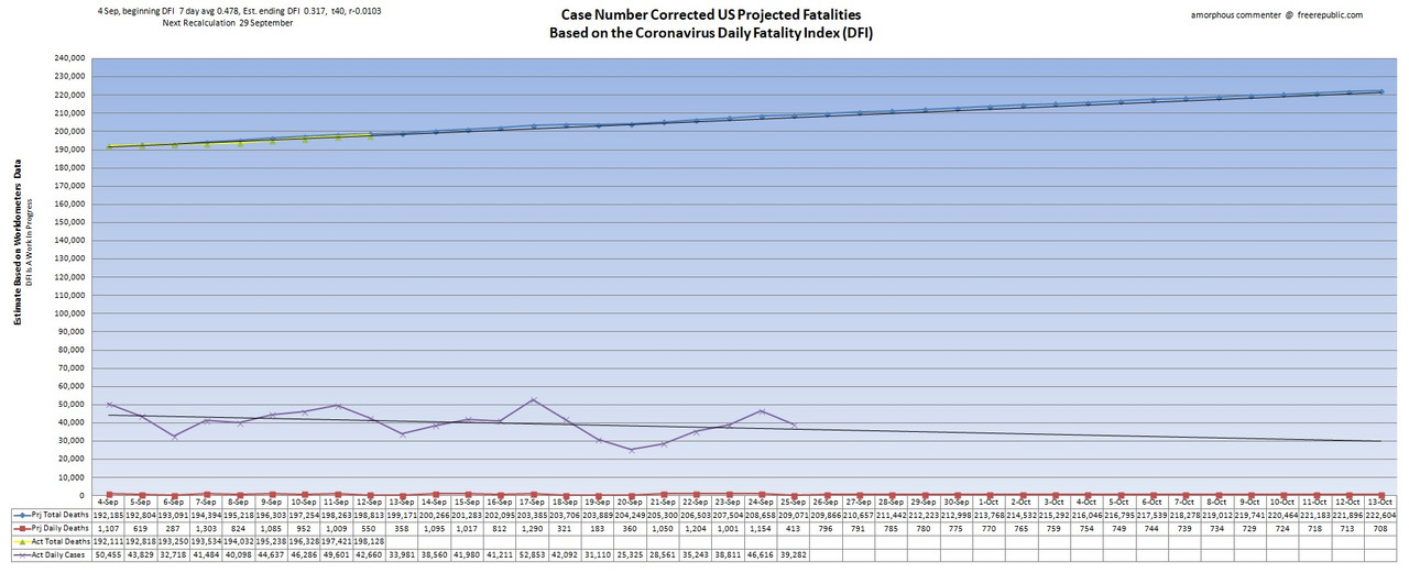
•Blue line represents projected death totals.
•Yellow line is actual death totals based on WorldofMeters.info data.
•Purple line is actual daily cases offset by 14 days.
•Red line represents projected daily deaths.
•Black extension lines are trend lines.

19 posted on 09/13/2020 5:12:34 PM PDT by amorphous
[ Post Reply | Private Reply | To 18 | View Replies ]

Free Republic
Browse · Search
News/Activism
Topics · Post Article


FreeRepublic, LLC, PO BOX 9771, FRESNO, CA 93794
FreeRepublic.com is powered by software copyright 2000-2008 John Robinson