
Posted on 10/16/2009 10:12:52 PM PDT by cogitator
The late inspiration for this was a book I saw in the bookstore, "Ansel Adams in Color", linked above. Very good photography (as you might expect), but not as iconic like his black-and-white images.
So for fun I'm posting a picture of Vernal Falls from Adams in black-and-white and another one from nearly the same vantage in color. Which do you like better? That doesn't mean that color or B&W is really better, it's just an artistic perception.
Also included are a couple of aerial shots. I didn't realize how close these falls are to Half Dome; that's because I haven't been to Yosemite and it's definitely a place I want to get to.
Click for full-size.
Click for full-size. 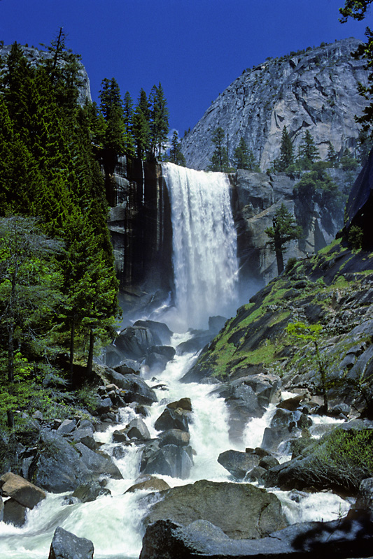


** ping **
Part of the problem is that the color shot is taken from a slightly different location and probably with a different sized lens. Adams was technically very good in the dark room, average on actually capturing images, and I have to admit that most of his stuff leaves me cold. It lacks any sense of human contact. I much prefer the works of Weston. Now there was a guy who hated the dark room ( shot 8X10 mostly so he just did contact prints illuminated by a single overhead light bulb). He was masterful at actually capturing the image. Brilliant
I have to point something out; the long-distance shots are from an overlook, not aerial (i.e., from something flying).
Another aspect is, the photographs (either flavor) are being rendered on a computer screen and kind of slough over the attention Adams gave to black levels and areas of heightened contrast. I notice the Adams waterfall picture doesn’t “freeze” the falling water in an especially appealing (to me) way, not that I need to be able to resolve every drop, but the blurry water in this case doesn’t really grab me. Also, the blacks appear to be crushed. That is NOT meant as racist comment! The color shot appeals to me more because it is less work to digest. I will confess, I used to be a lot more impressd with Adams stuff than I am today, but my eyesight used to be better, LOL.
Magnifique!
The Adams image is probably nowhere close to the fine grain of the original; his originals are (to state the obvious) very sharp.
Now with digital and Photoshop all bets are off.
All nice.
I took my wife there on our honeymoon, and we hiked this trail. I have probably a 100 D60 photos of these falls.
I took a nap on a slab of rock near the first falls and woke up thinking a dump truck just passed by me. After I thought about that for a minute, I figured it may have been a minor earthquake.
When we were there in the mid-80’s, this falls were almost dry. Much more impressive with the greater flow.
bump
Maybe it’s my monitor, but the colors on the first color picture look unnatural. It’s almost like the contrast has been cranked up a bit. Other than that, it’s difficult to make a valid comparison between the two simply based on color versus b&W due to some reasons previously mentioned as well as the difference in sky. It is clear in the color image and appears overcast in the b&w, lending a totally differnt mood.
ping for later
I hope to get there someday, too. I’ve flown over it to SF nearby, but never quite got there, yet.
Half Dome is off camera to the left in this photo. I've hiked Half Dome many times, and have a drawer full of pictures.
The fourth photo is a big red-x for me. The third one shows Vernal Falls below and Nevada Falls above, with Liberty Cap to the left of the upper falls. It's shot from (or near) Glacier Point.
Here's yours truly on Half Dome...


Disclaimer: Opinions posted on Free Republic are those of the individual posters and do not necessarily represent the opinion of Free Republic or its management. All materials posted herein are protected by copyright law and the exemption for fair use of copyrighted works.