
Repeat of the old hockey-stick: The last 2,000 years.
Posted on 03/15/2013 9:20:32 PM PDT by Ernest_at_the_Beach
It's Friday evening in the USA but Saturaday in Australia....
Just came across this....and it has a lot of Graphs...have not read thru it at all....but they are trying the Good ole Mann Hockey stick again....
Too much MONEY at stake for the leftie Politicians ....they just have to keep LYING!
************************************************************************************
****************************************************************************************
The message to the world is unequivocal:
“We are heading for somewhere that is far off from anything we have seen in the past 10,000 years – it’s through the roof. In my mind, we are heading for a different planet to the one that we have been used to,” said Jeremy Shakun of Harvard University, a co-author of the study.
Source: The-world-is-hottest-it-has-been-since-the-end-of-the-ice-age–and-the-temperatures-still-rising.
There are two factors in the new Marcott paper that are major red flags. For one, there is hardly any data in the modern end of the graph. Ponder how researchers can find 5,000 year old foraminifera deposits, but not ones from 1940? Two: they’ve smoothed the heck out of longer periods. Marcott et al clearly say there is “…essentially no variability preserved at periods shorter than 300 years…” So if there were, say, occurrences of a warming rise exactly like the last century, this graph won’t show them.
Some of the data has a resolution as poor as “500 years” and the median is 120 years. If current temperatures were averaged over 120 years (that would be 1890 to now), the last alarming spike would blend right in with the other data. Where would the average dot be for the “last 500 years”. It would be low, cold, and there would be no hockeystick at all in a “500 year” averaged graph. But if there was a period of rapid warming sometime in the last 10,000 years, one which occurred over say, 50 years, it would disappear amongst the uncertainties.
Robert Rohde (of the BEST Project) points out that so much of the variance is lost that it is equivalent to smoothing the series with a 400 year running average, saying “it will completely obscure any rapid fluctuations having durations less than a few hundred years.”
It may be necessary to sacrifice the variance, and blend and blur those past peaks (given the uncertainties) but after doing so, how can Marcott et al say anything at all, even a squeak, about the rate of warming in the last 100 years?
In the end the hockey stick seems to come from a 20 year “reconstruction” of data that has a median of 120 year resolution. Would that have the effect of heavily weighting some proxies while smoothing out the others? It’s all very well to trumpet that there are 73 proxies, but some of them obviously count for a lot more than others.
Repeat of the old hockey-stick: The last 2,000 years.
The new hockey-stick blends high and low resolution data from many proxies in the past with mixed resolution data (but few proxies) in recent times. It’s a complex method which produces something not seemingly reflected in the actual proxy data. Where are the hockey-stick-proxies? It also doesn’t help that ten percent of all 73 proxies fail their own criteria for inclusion. (Thanks to Willis for all those spectacular spaghetti graphs, and thanks to both Craig Loehle, and Roberto Soria for advice).
Am I reading this incorrectly? Note fig a and fig e here. See that dive to zero on the right hand edge — just at the point that the “hockey-stick” appears in lower graphs? Are there virtually no proxy records during the time of the spike? Note that the lines in the other graphs here come from “temperature reconstructions” which are area weighted and “Monte Carlo” based graphs.

.Fig. S10: Temperature reconstructions separated by latitude. (a) Number of records used to construct the temperature stack through time for the 5×5 degree weighted 90-60°N sites (black line), 60-30°N sites (blue line), 30-0°N sites (green line), 0-30°S sites (pink line), 30-60°S sites (purple line), and 60-90°S sites (brown line). (b-d) 5×5 degree weighted temperature envelope (1-σ) of the global temperature anomaly (blue fill) plotted against the 5×5 degree weighted latitudinal sites. Uncertainty bars in upper left corner reflect the average Monte Carlo based 1σ uncertainty for each reconstruction, and were not overlain on line for clarity. e-h same as a for the last 11,300 years. Temperature anomaly is from the CE 1961-1990 average. Note that b and f have larger y-axes, but are scaled the same as the axes in c,d,g,h. (Click to enlarge)
See also the next figure. Note in a and d, the ragged edges as the proxies run out of data on the right? See how the number of records plummets to zero? Note how this correlates with the spike (c and f). Steve McIntyre writes that the Alkenone proxies are the largest group of proxies (31 of 73) yet the uptick is mysteriously absent from the data. McIntyre does not believe that the uptick is due to splicing in of the instrumental data, but cannot explain it yet. Can Marcott explain it? You would think so, but his response left McIntyre baffled.

Fig. S11: Temperature reconstructions separated by ocean vs land. (a) Latitudinal distribution of the records used to construct the terrestrial (brown bars), and ocean records (blue bars). (b) Number of records used to construct the temperature stacks through time (terrestrial – brown line; ocean–blue line). (c) Global temperature anomaly 1-σ envelope (5×5 degree weighted) (blue fill) and terrestrial (brown), and ocean records (blue). Uncertainty bars in upper left corner reflect the average Monte Carlo based 1σ uncertainty for each reconstruction, and were not overlain in plot for clarity. d-f same as a-c for the last 11,300 years. Temperature anomaly is from the CE 1961-1990 average. (Click to enlarge)
Notice in c, the hockey-stick spike is coming mostly from the “ocean”? Hmm.
Even Marcott admits the reconstruction of the modern spike is not robust in either the Northern or the Southern Hemisphere, and where else is there? (Thanks to Steve McIntyre for asking him).
Regarding the NH reconstructions, using the same reasoning as above, we do not think this increase in temperature in our Monte-Carlo analysis of the paleo proxies between 1920 − 1940 is robust given the resolution and number of datasets. In this particular case, the Agassiz-Renland reconstruction does in fact contribute the majority of the apparent increase.
…
Regarding the SH reconstruction: It is the same situation, and again we do not think the last 60 years of our Monte Carlo reconstruction are robust given the small number and resolution of the data in that interval.
So why all the newspaper headlines? The non-robust result turns into a PR message.
Did they mention this is the paper in paragraph four as Marcott says? Well, kind of — not really. Here’s a “hint”:
Without filling data gaps, our Standard5×5 reconstruction (Fig. 1A) exhibits 0.6°C greater warming over the past ~60 yr B.P. (1890 to 1950 CE) than our equivalent infilled 5° × 5° area-weighted mean stack (Fig. 1, C and D). However, considering the temporal resolution of our data set and the small number of records that cover this interval (Fig. 1G), this difference is probably not robust. Before this interval, the gap filled and unfilled methods of calculating the stacks are nearly identical (Fig. 1D).
He’s saying the “difference” between the two versions is not robust, but not that the main feature of the graph is fickle, flakey, or may disappear under analysis. (Thanks to McIntyre and Eschenbach for spotting that.)
Me, I wonder why Science published the paper in the first place?
Now look at the graphs of the actual proxies offered in the supplementary material. Note how the proxy data – in red and blue lines shows no hockey-stick. But this is the tropics, so that’s not unexpected.

Fig. S5: Upper. Map showing location of sites. Lower. Temperature reconstructions at select sites where different proxy-based reconstructions were used. In each of these comparisons, the blue lines represent temperature reconstructions derived from alkenones (UK’37) and the red lines represent temperatures from planktonic foraminifera (Mg/Ca).
Same with these northern hemisphere proxies. No hockey stick in this data either?
A lot of the data is from the ocean, which shouldn’t rise and fall nearly as much as land based data, yet apparently caused the spike?

Fig. S6: Left. Temperature reconstructions at select sites where different proxy-based reconstructions 157 were used. (a) Pollen temperature reconstruction (blue) compared with chironomid records (red). (b) 158 Alkenone (UK’37) record (blue) compared with radiolaria record (red). (c,d) Alkenone records (UK’37) (blue) 159 compared with TEX86 records (red). (e) Alkenone record (UK’37) (blue) compared with branched 160 tetraether membrane lipid (MBT) record (red). Right. Map showing location of sites. (Click to enlarge)
The spike below certainly looks spectacular on the 11,000 year scale. Great “visual”, nice “optics” but we struggle to point to many actual proxy data points from individual sites that shows this shape, let alone many widespread proxies which we ought to expect if this is a global temperature representation? Marcott averaged many non-spikes and got a spike … tricky eh?

Fig 1 B — The last 12,000 years
The supplementary material is extensive, which is commendable. It describes, at length, how they use simulations to reconstruct the global temperature. On top of that is a 20 year sampling done on the data in the last 1500 years. The hockey stick does not show in 100 year or 200 year samplings. (The blue line below is the 20 year sampling). It also did not show in the Marcott PhD thesis of 2011. The plot thickens?
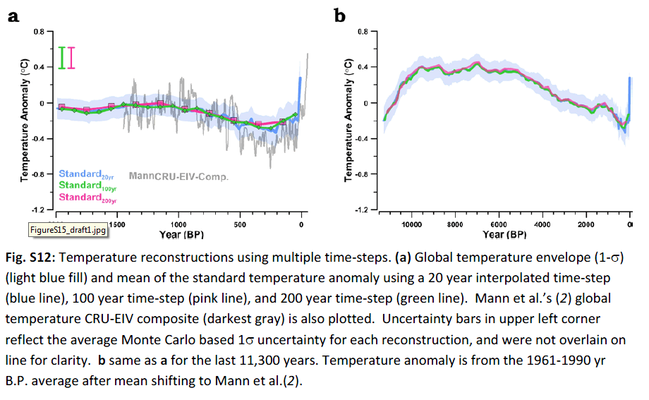
Fig. S12: Temperature reconstructions using multiple time-steps. (a) Global temperature envelope (1-σ) (light blue fill) and mean of the standard temperature anomaly using a 20 year interpolated time-step (blue line), 100 year time-step (pink line), and 200 year time-step (green line). Mann et al.’s (2) global temperature CRU-EIV composite (darkest gray) is also plotted. Uncertainty bars in upper left corner reflect the average Monte Carlo based 1σ uncertainty for each reconstruction, and were not overlain on line for clarity. b same as a for the last 11,300 years. Temperature anomaly is from the 1961-1990 yr B.P. average after mean shifting to Mann et al.(2). (Click to enlarge)
In their methods (below), the bolded phrase in point 3 describes how they chose to compare to “high-resolution” reconstructions of the past 1000 years, in this case to “Mann”. Their graph wouldn’t look as reliable if they compared it to Ljundqvist, or to Loehle…
They talk of using the instrumental record to check to see that their locations are representative of global temperature (which it may well be, but if they don’t have proxy data from recent times, they don’t have proxy data…).
To examine whether 73 locations accurately represent the average global temperature 271 through time, we used the surface air temperature from the 1×1° grid boxes in the NCEP-NCAR 272 reanalysis (83) from 1948-2008 as well as the NCDC land-ocean dataset from 1880-2010 (84). [Page 20 supplementary materials]

Fig. S16: Simulated global mean temperature for the last 11000 years (black) and the mean temperature at the 73 proxy sites (red) from the ECBilt-CLIO transient simulations (81).
Look at the downward slope, and uptick in b. Note how it doesn’t mesh with the red “model”.

Fig. S25: Simulated global and regional mean temperatures for the last 12000 years (red) from the ECBilt-CLIO transient simulations (81) and the Standard 5×5° weighted temperature stack from the proxy dataset from this study (black). The temperature is an anomaly from 6,000 yrs BP (± 200 yrs).
The authors describe how the North Atlantic has the largest disagreement with the model:
Comparing the temperature data and model simulations by region demonstrates that the largest data-model disagreement is in the mid-high latitude Northern Hemisphere sites while the data and model in the equatorial and mid-high latitude Southern Hemisphere sites are in agreement within the Monte Carlo based uncertainty after 9,000 yrs BP (Fig. S25b,c,d). When the North Atlantic proxy sites that show the largest temperature changes are removed, the data and model are within the Monte Carlo based uncertainty, both in the global stack and the mid-high latitude northern hemisphere stack (Fig. S26a,b). The data-model disagreement may suggest that the model could be missing a key climate component that is intrinsic to the North Atlantic basin. In particular, the AMOC may have slowed during the Holocene, resulting in an amplified cooling in the North Atlantic basin and a warming in the Southern Hemisphere that could have dampened any cooling effect expected from orbital tilt (87-89).
Here the northern Atlantic data is removed.
Fig. S26: Simulated global and regional mean temperatures for the last 12000 years (red) from the ECBilt-CLIO transient simulations (81) and the Standard 5×5° weighted temperature stack with the North Atlantic sites removed (black). The temperature is an anomaly from 6,000 yrs BP (± 200 yrs).
The Southern Hemisphere contains the fewest proxies. Food for thought?

Fig. S1: Location map and latitudinal distribution of proxy temperature datasets. Map of temperature datasets from this study with temperature proxy identified by color coding (dots) and datasets used in Mann et al. (2) (crosses). (Inset) Latitudinal distribution of data from this study (red) and Mann et al. (2) (gray). Note break in y-axis at 25.
There is much entertainment on skeptic blogs as this epic study gets unpacked. Tune in this weekend…
It’s just a shame that science authors are in such a rush to get their news headlines that they don’t publish online first (or ask Steve McIntyre to review it), so they could iron out the details before hundreds of thousands of people were told a story that didn’t… stack up.
Lewis, S.E., et al., Post-glacial sea-level changes around the Australian margin: a review, Quaternary Science
Reviews (2012), http://dx.doi.org/10.1016/j.quascirev.2012.09.006 [abstract] (paywalled).
Ljungqvist, F. C., Krusic, P. J., Brattström, G., and Sundqvist, H. S (2012).: Northern Hemisphere temperature patterns in the last 12 centuries, Clim. Past, 8, 227-249, doi:10.5194/cp-8-227-2012, 2012. [abstract] [PDF] or try this [PDF] [CO2science discussion]
Svend Funder1, Hugues Goosse, Hans Jepsen, Eigil Kaas, Kurt H. Kjær, Niels J. Korsgaard, Nicolaj K. Larsen, Hans Linderson, Astrid Lyså, Per Möller, Jesper Olsen, Eske Willerslev, ‘A 10,000-Year Record of Arctic Ocean Sea-Ice Variability—View from the Beach’, Science 5 August 2011:Vol. 333 no. 6043 pp. 747-750 DOI: 10.1126/science.1202760
Weekend reading....however the first few paragraphs pretty much give the story.
The hockey stick is a fraud and global warming is a fraud.
Validity of “A Reconstruction of Regional and Global Temperature for the Past 11,300 Years”
Tick, tick, tick – how long will the new Marcott et al hockey stick survive? ( AGW Nonsense)
Thanks Ernest.
No hockey stick, just red card and penalty box.
Disclaimer: Opinions posted on Free Republic are those of the individual posters and do not necessarily represent the opinion of Free Republic or its management. All materials posted herein are protected by copyright law and the exemption for fair use of copyrighted works.