Skip to comments.
Three Charts that Will Infuriate Taxpayers(Will get you mad all over again-guaranteed)
national review ^
| 10/21/10
| Deroy Murdock
Posted on 10/21/2010 11:23:28 AM PDT by bestintxas
With just 12 days until the November 2 elections, pro-market, small-government candidates, activists, and concerned citizens should study and then disseminate three charts that perfectly encapsulate the status quo that, if all goes well, the midterm vote will capsize.
The first of these looks as intricate as an integrated circuit. Titled “Your New Health Care System,” this schematic shows how Obamacare’s hundreds of moving parts will fit together and whirl — or not, as rising health costs at Boeing, McDonald’s, and the United Federation of Teachers (to name a few affected organizations) already reveal.
Staff members at the Congressional Joint Economic Committee “spent four months, night and day, and weekends” assembling this amazing graphic, Rep. Kevin Brady (R., Texas) tells me by phone. “They vetted it based on all 2,801 pages of the Obamacare legislation. They captured this new law’s stunningly complexity.”
Well, almost.
Literally scores of icons and symbols show how the president, the secretary of health and human services, the IRS, and other existing federal actors and agencies interact with Obamacare’s new entities including, among many others, the Elder Justice Coordinating Council, the Medicare Prescription Drug and MA-PD Complaint System, and the National Oral Health Public Education Campaign.
Even worse, the JEC’s diligent personnel could not fit all of this new law’s boards, commissions, mandates, and other elements onto this chart. So, by way of shorthand, they created “bundles of bureaucracy.” Beyond those functions delineated in the chart, these seven collective symbols respectively represent clusters of four loan repayment and forgiveness programs, four other new regulatory programs, 17 insurance mandates, 19 special-interest provisions, 22 other new bureaucracies, 26 other new demonstration and pilot programs, and 59 other new grant programs. These
(Excerpt) Read more at nationalreview.com ...
TOPICS: News/Current Events
KEYWORDS: federaljobs; federalpay; federalsalaries; privatesector; vote
Obama/Pelosi are throwing people out of work in order to increase the # of govt workers.
To: bestintxas
Truly nauseating.
Get to the polls!
2
posted on
10/21/2010 11:38:40 AM PDT
by
nagdt
("None of my EX's live in Texas")
To: bestintxas
Why would they be mad that the greedy, selfish, thieving taxpayers were finally getting their punishment?
3
posted on
10/21/2010 11:44:41 AM PDT
by
Tzimisce
(No thanks. We have enough government already. - The Tick)
To: bestintxas
I’m pretty sure that there are no new developments that could surprise, shock, infuriate, sadden and tick me off any more than I already am. My meter has been pegged off the charts for some time already.
I can say without any doubt that I can’t wait for Nov. 2 when Reid and Pelosi are pitched off the cliff into political oblivion. It will also be very nice to be able to refocus on the takedown of the prime target, Emperor Obumus the First.
4
posted on
10/21/2010 12:09:37 PM PDT
by
dajeeps
To: RingerSIX
Ping for steaming about this later.
5
posted on
10/21/2010 12:13:15 PM PDT
by
RingerSIX
To: bestintxas; CanGyrene; Fred Nerks; null and void; stockpirate; george76; PhilDragoo; Candor7; ...
6
posted on
10/21/2010 12:26:08 PM PDT
by
LucyT
To: bestintxas; LucyT; Liz; maggief; Arthur Wildfire! March
From the article:
"The JEC’s chart is both an incredibly impressive piece of graphic design and a jaw-dropping glimpse of the health-care Hell that awaits the American people."

Click here for a High-Resolution Chart in pdf format
...the JEC’s diligent personnel could not fit all of this new law’s boards, commissions, mandates, and other elements onto this chart. So, by way of shorthand, they created “bundles of bureaucracy.”
Beyond those functions delineated in the chart, these seven collective symbols respectively represent clusters of four loan repayment and forgiveness programs, four other new regulatory programs, 17 insurance mandates, 19 special-interest provisions, 22 other new bureaucracies, 26 other new demonstration and pilot programs, and 59 other new grant programs.
These 151 additional items within Obamacare do not appear individually on this diagram. As Representative Brady explains, “If we included all of these units, this chart would be three times larger.”
7
posted on
10/21/2010 12:37:41 PM PDT
by
thouworm
To: LucyT
lol...we’re on the same neuron path.
8
posted on
10/21/2010 12:41:01 PM PDT
by
thouworm
To: thouworm
The two other charts from article:


9
posted on
10/21/2010 12:48:09 PM PDT
by
thouworm
To: bestintxas
The Tea Party slogan, “We are mad as hell and we aren’t going to take it anymore!” I also like, “Throw the bums out!”
10
posted on
10/21/2010 1:01:26 PM PDT
by
Jvette
To: thouworm; stephenjohnbanker; hoosiermama; maggief; GOPJ; STARWISE; sickoflibs; marstegreg; ...
Thanks for the headsup.
........diligent personnel could not fit all of O'Care's new law’s boards, commissions, mandates, and other elements on this chart (above). So they created “bundles of bureaucracy.” Seven collective symbols respectively represent clusters of four loan repayment and forgiveness programs, four other new regulatory programs, 17 insurance mandates, 19 special-interest provisions, 22 other new bureaucracies, 26 other new demonstration and pilot programs, and 59 other new grant programs.....
These 151 additional items within Obamacare do not appear individually on this diagram. As Representative Brady explains, “If we included all of these units, this chart (above) would be three times larger.”
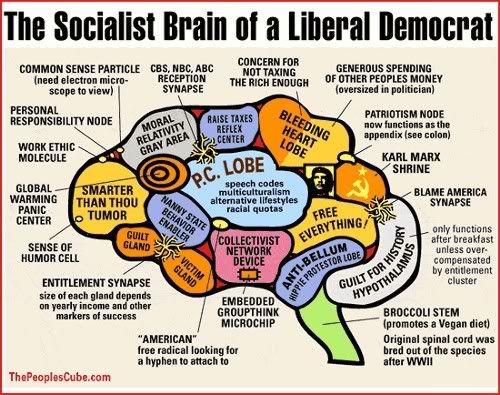
Wonder no more about the sap-happy progressive "brain" that thought up this monstrosity.
11
posted on
10/21/2010 1:04:16 PM PDT
by
Liz
(Nov 2 will be one more stitch in Obama's political shroud.)
To: LucyT; thouworm
Sheesh!!!! I’m lookin for a bottle of hooch after those posts ;-)
To: bestintxas
I need to check this out later....
13
posted on
10/21/2010 1:19:45 PM PDT
by
Verbosus
(/* No Comment */)
To: Liz
Those are great charts if someone needs to raise their blood pressure - for the rest of us, they’re rough! Thanks for posting...
14
posted on
10/21/2010 2:53:28 PM PDT
by
GOPJ
('Power abdicates only under the stress of counter-power." Martin Buber / Teanami's coming...)
To: bestintxas
15
posted on
10/21/2010 3:00:32 PM PDT
by
neverdem
(Xin loi minh oi)
To: bestintxas
16
posted on
10/21/2010 3:30:05 PM PDT
by
GailA
(obamacare paid for by cuts & taxes on most vulnerable Veterans, retired Military, disabled & Seniors)
To: thouworm
Hmm, which would make for an easier life? Work for the feds or be an illegal on welfare... decisions, decisions.
17
posted on
10/21/2010 8:31:49 PM PDT
by
bgill
(K Parliament- how could a young man born in Kenya who is not even a native American become the POTUS)
To: LucyT
Looks like this is striking a nerve!
[I have to trust you guys on this — I don’t load images, just text.]
18
posted on
10/23/2010 8:35:40 AM PDT
by
Arthur Wildfire! March
(Economic reform without education reform and originalism is a penny in the fuse box.)
To: thouworm
19
posted on
10/23/2010 8:36:27 AM PDT
by
Arthur Wildfire! March
(Economic reform without education reform and originalism is a penny in the fuse box.)
Disclaimer:
Opinions posted on Free Republic are those of the individual
posters and do not necessarily represent the opinion of Free Republic or its
management. All materials posted herein are protected by copyright law and the
exemption for fair use of copyrighted works.
FreeRepublic.com is powered by software copyright 2000-2008 John Robinson
