To: SeekAndFind
this is not a "scientific explanation" - the author just posts claims and political reasoning
If you look at the empirical evidence from the 1918-1920 Spanish flu the findings demonstrate a strong association between early, sustained, and layered application of nonpharmaceutical interventions and mitigating the consequences of the 1918-19 influenza pandemic in the United States. This separate study shows the same - lockdowns emphatically and empirically work
cities that adopted the most aggressive social distancing measures had the highest economic growth after the restrictions were lifted.
Moreover, cities that implemented NPIs 10 days earlier than other cities increased their manufacturing employment by 5% more than those that imposed restrictions later. The difference lasted through to 1923.
Overall they found an additional 50 days of social-distancing was associated with a 6.5% percent increase in manufacturing employment.
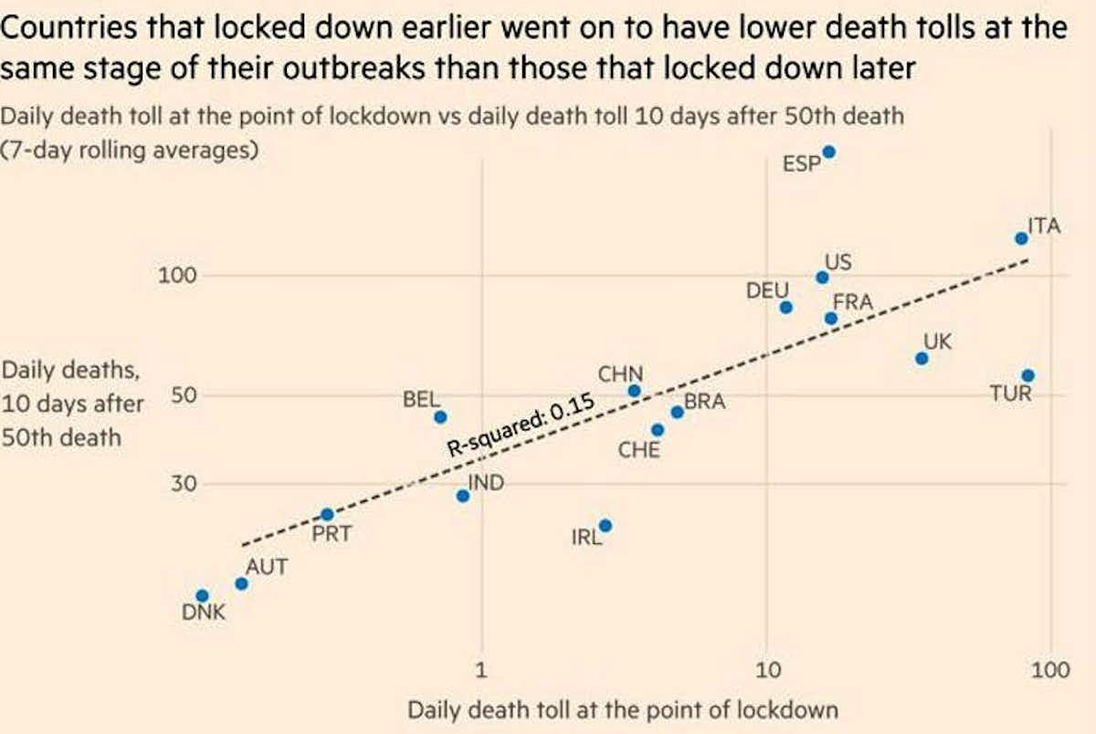
Countries that went into lockdown early - Austria, Poland, Czechia, Slovakia, Romania, Greece, Portugal, Germany were hit far less hard than those who went into lockdown LATE like Italy, Spain, France, the UK and Sweden.
15 posted on
05/14/2020 9:58:35 PM PDT by
Cronos
(Re-elect President Trump 2020!)
To: Cronos
I don’t know what the #### that charts means and I don’t care.
People die. This time it’s from a virus that picks on the weak and old.
Take some precautions and live life.
I can’t stand what faggots this country has become.
17 posted on
05/14/2020 10:13:27 PM PDT by
dp0622
(Radicals N racists dont point fingers at me I'm a small town white boy Just tryin to make ends meet)
To: Cronos
That’s a meaningless chart. It assumes: 1, they know the date of first infection from each nation’s patient zero, and delta time to the decision to lockdown are at all analogous. 2, it seems there is no adjustment for size of each nation’s population, and the "death count". 3, it acts as if every nation is homogenous in its death rate, regardless of population density related to lockdown. 4, assumes every nation are somehow equal when counting deaths, and that, 5, lockdown is the only variable that could possibly effect daily death counts.
It’s absurd. It’s a chart put together by a person who has no clue what he’s measuring, or what he’s trying to compare, and in fact is comparing many unsimilar things. It’s throwing data against the wall and saying, see, they correlate. But what do they correlate when nothing is normed?!
As for comparing ANYTHING to the Spanish Flu epidemic as a analog for what should be done today, there’s no possible comparison. They quarantined the SICK, not the healthy. The shut down travel, and limited contact through social distancing, and instituted cleaning and strict antiseptic practices, even though they had no knowledge of viruses, but not the economy.
To analogies to the Spanish Flu with its millions of dead is sheer fear mongering, especially when we don’t see anywhere near those levels of contagion or mortality in COVID19.
22 posted on
05/15/2020 12:42:54 AM PDT by
Swordmaker
(My pistol self-identifies as an iPad, so you must accept it in gun-free zones, you hoplophobe bigot!)
To: Cronos
Incidentally, exactly WHAT DATE are the authors of that chart using for the US’s adoption of “total lockdown”? Curious minds want to know.
Seven US states (14%) never participated, never ordered a lockdown, and various other states locked down on various other dates. Some states called modified lockdowns. It was not an homogenous, specific date.
So do tell, how was the specific plotted US lockdown date determined?
How about that one marked “China,” which kept their data hermetically sealed, and later claimed remarkably few deaths or infection per population in other cities?
I think it’s like the other data on that high school level chart, it’s ad hoc, made up, like most data propping up progressive talking points these days. It looks good until someone applies the smell test.
23 posted on
05/15/2020 12:56:08 AM PDT by
Swordmaker
(My pistol self-identifies as an iPad, so you must accept it in gun-free zones, you hoplophobe bigot!)
FreeRepublic.com is powered by software copyright 2000-2008 John Robinson