Posted on 08/16/2021 4:56:03 AM PDT by MtnClimber
What with the ongoing catastrophe in Afghanistan and the earthquake in Haiti, among other news, you may have failed to notice that the IPCC came out on Monday with substantial parts of its long-awaited Sixth Assessment Report on the state of the world’s climate. This is the first such assessment issued by the IPCC since 2014. The most important piece is the so-called “Summary for Policymakers,” (SPM), a 41 page section that is the only part that anyone ever reads.
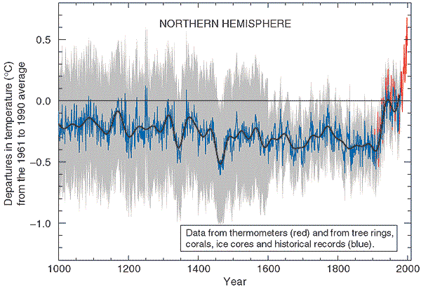
The IPCC attempts to cloak itself in the mantle of “science,” but its real mission is to attempt to scare the bejeezus out of everyone to get the world to cede more power to the UN. Beginning with its Third Assessment Report in 2001, the lead technique for the IPCC to generate fear has been the iconic “hockey stick” graph, supposedly showing that world temperatures have suddenly shot up dramatically in the last 100 or so years, purportedly due to human influences. The 2001 Third Assessment Report thus prominently featured the famous Hockey Stick graph, derived from the work of Michael Mann and other authors. Here is that graph from the 2001 Report:
As longtime readers here know, the Hockey Stick was then demolished by the work of Canadian mathematician Stephen McIntyre through his work at his website Climate Audit. The main issue was that the temperature “proxies” that had been used to create the “shaft” of the Hockey Stick, particularly various tree ring series, could not be shown to have any close relationship to actual temperatures; and moreover, there were strong reasons from many sources to think that the Medieval Warm Period (approximately 1000 - 1300 AD) had been warmer than the present.
And then came the ClimateGate emails of 2009. From my post of February 22, 2018:
The coup de grace for the Hockey Stick graph came with the so-called Climategate emails, released in 2009. These were emails between and among many of the main promoters of the climate scare (dubbed by McIntyre the "Hockey Team"). Included in the Climategate releases were emails relating specifically to the methodology of how the graph was created. From the emails, skeptical researchers . . . discovered that the graph's creators had truncated inconvenient data in order to get the desired depiction.
One particular series that had gone into creation of the Hockey Stick had come from a guy named Keith Briffa. Briffa’s series diverged greatly from actual temperatures, going down (declining) substantially after about 1960 when temperatures measured by thermometers had gone up. This fact needed to be concealed in order to sustain the Hockey Stick presentation. So the creators simply deleted the inconvenient information. The most famous of the ClimateGate emails, copied among various Hockey Stick participants (including Mann), dated November 16, 1999, discussed the situation in these terms:
I’ve just completed Mike’s Nature trick of adding in the real temps to each series for the last 20 years (ie from 1981 onwards) amd from 1961 for Keith’s to hide the decline.
In any rational world, that email alone would have ended the careers of all of these participants. In the actual world where we live, Mann continues to hold a prestigious position at Penn State University, and in February 2018 he won the AAAS award for “Public Engagement With Science.”
And with that background, we come to this week’s SPM. After a few preliminaries, here’s the big scary headline:
Human influence has warmed the climate at a rate that is unprecedented in at least the last 2000 years
And to prove it? Yes, it is another Hockey Stick graph. Although coming from different authors and seemingly different data, it bears a striking resemblance to the Mann, et al., graph of 2001.
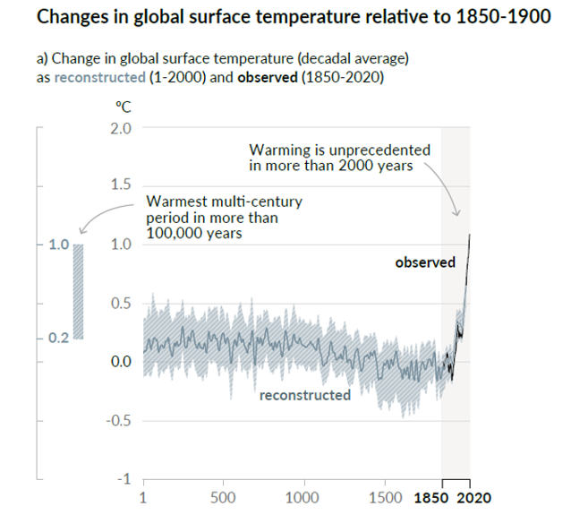
McIntyre is promptly on the job again. Here is his post of August 11, basically dismantling the new Hockey Stick. If you have a taste for a lot of technical detail, I urge you to read the whole thing. But the gist is actually simple. This time these people were not going to get caught furtively “hiding the decline.” Instead, they announce boldly that they are simply going to exclude any data that do not fit the narrative that they are putting forth.
McIntyre goes through multiple of the data series that contribute to the “shaft” of the new stick. Most just appear to be random fluctuations up and down. But then there are the few key series that show the sharp 20th-century uptick needed to support the Hockey Stick narrative. One such series is the McKenzie Delta tree ring series from Porter, et al., of 2013. McIntyre goes back to that Porter article and quotes the passage that describes how the researchers chose those trees that would contribute to the series::
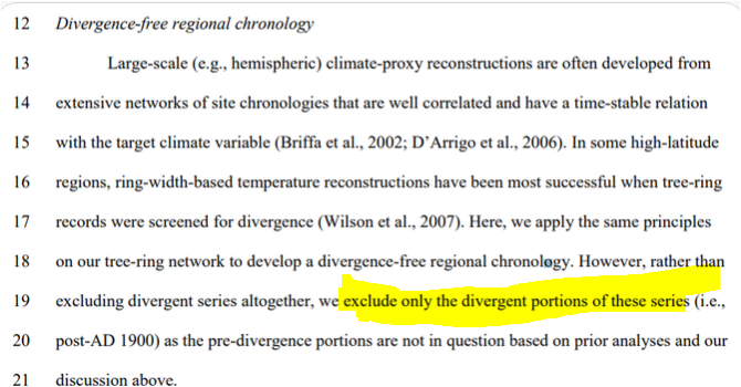
Got that? It’s a “divergence-free chronology.” You can get that by simply excluding any data that don’t conform to the result that you want. And you don’t even have to exclude whole trees from the series, but only those portions from a particular tree that just don’t seem to be going along.
McIntyre comments:
They took “hide the decline” to extremes that had never been contemplated by prior practitioners of this dark art. Rather than hiding the decline in the final product, they did so for individual trees: as explained in the underlying article, they excluded the “divergent portions” of individual trees that had temerity to have decreasing growth in recent years. Even Briffa would never have contemplated such woke radical measures.
Decide on your desired conclusion and then just exclude any data that refuse to go along. This is the “science” on which our world leaders are off spending multiple trillions of taxpayer dollars.
It pains me that some of my tax dollars get spent on this BS.
If it’s of any consolation...I live in a liberal area and I just don’t see everyone on board with this stuff...most people just want freedom and prosperity back.
Really IPCC? What made it so hot last time 2000 years ago? Funny how you never ask that simple question, isn't it? Interestingly, the '2000 year' figure leaves out the Roman Warming, a period of 500 years that were 3C-4C warmer than it is right now.
“Figgurs can lie, and liars can figgur.” As my Momma used to say.
The corrupt application of science to this number diddling is typical of folk involved. It is applied widely to anything they want. Emphasis “WANT”.
It is the same type of practice applied when thugs like BLM say that coppers hunt down blacks in the street.
With the widespread adoption of thermistors, electronic measurement of temperature and recording thermometers, the game changed. A hundred years ago a thermometer was read manually once or twice a day, and some were capable of recording the day’s high and low. Averages were computed by simple arithmetic from the daily readings. With continuous recording, the means of calculating changed. not necessarily for nefarious reasons, but that doesn’t really matter. With a continuous recording, the average is computed by integrating the area under the temperature trace (calculating the area under the plotted temperatures) and dividing by the length of the average time period (day, week, etc.). It made it easier.
But weather stations tended to sprout up at places like airports or in cities, or growth of cities took place around older weather stations, putting many of them inside “heat islands”. Some have even been documented to be on hot rooftops, or located near the exhausts of A/C and refrigeration systems. And every hot wisp of air that passes by is included in the automatic calculation.
Or these bloated bureaucrat bastards are simply lying.
Disclaimer: Opinions posted on Free Republic are those of the individual posters and do not necessarily represent the opinion of Free Republic or its management. All materials posted herein are protected by copyright law and the exemption for fair use of copyrighted works.