
Posted on 08/17/2013 6:49:57 AM PDT by Twotone
Maps can be a remarkably powerful tool for understanding the world and how it works, but they show only what you ask them to. So when we saw a post sweeping the Web titled “40 maps they didn’t teach you in school,” one of which happens to be a WorldViews original, I thought we might be able to contribute our own collection. Some of these are pretty nerdy, but I think they’re no less fascinating and easily understandable.
(Excerpt) Read more at washingtonpost.com ...
One shows Borneo is unfriendly to foreigners? I thought they loved to have visitors for dinner!
8^)
Ireland truly is the Emerald Isle, all winter long.
They can thank Cape Hatteras, NC for that, for sending them the Gulf Stream. County Cork in the south of Ireland has trees that look a lot like palm trees, and a maritime climate along the lines of San Francisco. Wouldn’t call it warm, but rarely cold. They do get snow up in the hills and mountains, County Wicklow and so forth, but not persistent snow cover that would show in a satellite time lapse.
Of course. Snow in Cleveland and Moscow.
This can’t be right. It shows that Minnesota occasionally is FREE of snow ...
Thanks! Very cool.
I love pointing out to CAGW Alarmists that Chicago used to be under a mile of ice.
Thank you for an enlightening post :)
Unfortunately, all this post really shows is how a bunch of liberal professors can tailor maps to their liking by doing a biased “study.”
It’s like stats that claim the U.S. has a high infant mortality rate compared to Europe. Now for the truth: the U.S. considers premature births in their infant mortality rates because *U.S. doctors actually value these babies and try to save them.* European doctors just don’t count preemies in their stats. Therefore, they could put out a bogus map claiming higher infant mortality rates in the U.S.
Many of these maps are way to subjective to be of any value whatsoever.
Cool map. What is that from?
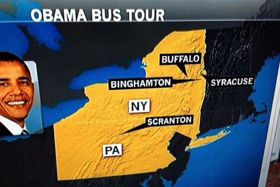
Someone’s never been north of the five boroughs of NYC.
that’s rich... not even close with where the city names point to.
Some of those maps are ridiculous. Map #9 shows central African nations as more ethnically diverse than the U.S. There are quite a few other such issues on these maps.
Yep. I had a few issues with some of them. But I always enjoy FReeper comments on such things. :-)
Disclaimer: Opinions posted on Free Republic are those of the individual posters and do not necessarily represent the opinion of Free Republic or its management. All materials posted herein are protected by copyright law and the exemption for fair use of copyrighted works.