Posted on 06/20/2023 9:40:07 AM PDT by Red Badger
(NASA's Scientific Visualization Studio) We know human activity is inflating the amount of carbon dioxide in the atmosphere at record rates, restricting the radiation of heat into space and contributing to the overall warming of the planet.
Invisible as they are, the ebb and flow of carbon emissions can be hard to wrap our heads around – but not so with new visualizations released by NASA's Scientific Visualization Studio.
These jaw-dropping videos demonstrate precisely where the majority of this critical greenhouse gas is being released, and how that changes over the course of a single year.
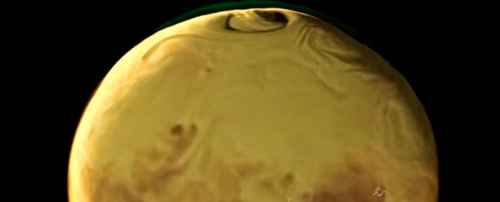
There are three videos to look at, covering different regions of the world. They show CO2 being released in 2021, with emissions colored orange for fossil fuels, red for burning biomass, green for land ecosystems, and blue for the ocean.
Blue dots show where carbon is largely being absorbed by ocean waters, and green dots by producers on land.
VIDEO AT LINK...........
There are a few particular areas to look out for in the above video: over North America and South America, look out for the pollution hotspot in the northeastern region of the US, and the green pulsing of the Amazon rainforest as the trees absorb carbon during daylight hours.
Note how the color orange dominates the atmosphere, and how the fossil fuel emissions it represents spreads to envelop the entire planet as the months roll by. If you ever needed a stark reminder of the effect of burning coal, gas, and oil, here it is.
"New computer modeling techniques in NASA's Global Modeling and Assimilation Office allow us to dissect our atmosphere and understand some of the major contributors to this runaway insulator," explains NASA in the accompanying blog post.
VIDEO AT LINK............
In this second clip above, featuring Europe, the Middle East, and Africa, you can see higher concentrations of fossil fuel emissions being released from the European nations and Saudi Arabia. There's also a less noticeable cloud of red agricultural burn emissions coming from central Africa.
When it comes to the Asia and Australia video, featured below, a significant amount of pollution obscures Beijing in China. Compare that to the relative lack of fossil fuel emissions from Australia – a country with a relatively low population density.
VIDEO AT LINK.............
Not that it absolves the nation of responsibility, which has the highest coal emissions per capita in the world. Packing Australia's 26-odd million citizens into a single city might give this animation a slightly different look.
What's also quite depressing (and visible in yet another video) is the way land and ocean CO2 exchanges battle to remain balanced in the atmosphere. It's the fossil fuel emissions that tip the CO2 levels above the status quo.
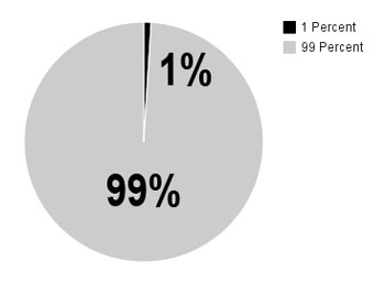
While carbon dioxide accounts for just 0.04 percent of the gases in Earth's atmosphere, it has a significant effect in terms of scattering heat radiation back towards the surface.
Current levels are a smidge under 420 parts per million; a level that might seem low but is higher than it's been for millions of years. It's certainly higher than it's ever been since humans have been around. The trend is only going in one direction too – we should be drastically cutting down on fossil fuel use, but we're not.
All of which means heatwaves, droughts, floods, and storms that are more extreme and more frequent, as well as new climate zones for half the planet, devastating effects on wildlife, and an increased risk of pathogenic disease.
Action can still be taken to mitigate climate change, but the changes need to be big and they need to be quick. Let's hope visualizations like NASA's new videos help to drive home just how much trouble we're in.
Oh my more CRAP
When you’re a hammer how many things look like a nail?
OH MY GOD WE’RE ALL GONNA DIE!!!!!
That is guaranteed.................
Especially when it is flowing out of my pocket into theirs.
There was slightly more CO2 for a quick minute, and the plants rejoiced and turned it into O2, and NASA sent out it’s storm troopers to stomp on the plants, because they were bad.
“Oh my more CRAP”
Yes, it has always been that way... Outright fraud with this one.
OH MY GOD!!! We are doomed. Just LOOK at all that invisible beneficial CARBON DIOXIDE!!!
Tell it to China and India.
I am God and I decree that a co2 saturation of 1,000 parts per million is ideal. Ocean front property for everyone and year round growing seasons. No more freezing to death. All life is precious.
Please note the the graph has numbers on it. So it must be accepted without question.
(See, NASA? I can make stuff up as easily as you can.)
Gosh, a 3D plot of all the nice CO2 that gave us the FABULOUS winter of ‘23, the best ski year EVAH!
Thanks, NASties!

-PJ
No amount of money can fix the ‘climate crisis.’ We must all surrender out freedoms to powerful wise unelected all powerful untouchable government officials in Brussels. Every aspect of our life must be controlled by the likes of AOC who are the only ones qualified to make decisions for the entire world economy. AND, yes, we must stop breeding and adopt the “Logan’s Run” method of population control. We have a planet to save....
Disclaimer: Opinions posted on Free Republic are those of the individual posters and do not necessarily represent the opinion of Free Republic or its management. All materials posted herein are protected by copyright law and the exemption for fair use of copyrighted works.